What More Do You Need?

Hot TubThese cold, dark, damp Seattle winter days have me thinking about ways to keep warm. I love this elemental hot tub. The wood-fueled heat exchanger is a simple and obvious example of form following function. The tub is a half-sphere, with squat legs and a useful side shelf. Cold water, supplied with a garden hose, is mixed with steam-heated water to regulate the desired temperature. The couple looks like they are steeping in a colossal cup of tea!

Once in a while, a designed object hits all the right notes.

It is only as complicated as it needs to be in order to work. It performs its job with elegant efficiency. Its material is well suited to the application and the material’s properties are appropriately exploited. The object’s use is obvious to the user.

Its form and function resonate with one another, clear as a bell.

The photo was featured on a Metropolis Magazine cover, sometime before 2003. The Dutchtub Original was designed by Floris Schoonderbeek. The quote above is from Sweet Spot, posted in this blog in September 2012.

Feel free to share this image, but please provide a link back to 2H Pencil.

I invite your comments.

Illusions, No. 1

This California garden looks like the sea floor.  The plants look like sea-dwelling creatures and plants. The imagination swims!

Beachside succulent garden; Sep'12; "underwater" plants

Beachside succulent garden; Sep'12; Tide pool beach garden n Corona Del MarSucculents expert and horticulturist Joe Stead says, “As a kid, I explored tide pools …I marveled at the starfish and sea anemones. I wanted to bring that sense of wonder to this garden.”

With great knowledge and skill, he has selected and arranged boldly colored, drought-tolerant plants to create charming and compelling illusions.

Beachside succulent garden; Sep'12; Tide Pool Beach Garden n Corona Del Mar, CA    The “sea anemones” are agaves, nestled among red mangaves.

Beachside succulent garden; Sep'12; Tide pool beach garden n Corona Del Mar  The “starfish” is Echeveria subrigida.

Beachside succulent garden; Sep'12; "underwater" plantsThe “kelp” is Senecio vitalis.

All photos courtesy of Bret Gum; written content is derived from the article “How to create a sea-creature succulent garden,” written by Debra Lee Baldwin, in Sunset Magazine.

Feel free to share the content of this blog, but please provide a link back to 2H Pencil.

I invite your comments.

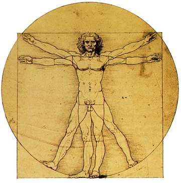
Symmetry

Like butterflies, most other animals, and some plants,

we humans possess bilateral symmetry. We have a center line, with basically the same stuff on the right and the left.

Researchers of social psychology essentially agree that the faces we find most alluring are also the most symmetrical ones. To be physically balanced on either side of a center line is considered a primal hallmark of health and, therefore, beauty.

Just as we viscerally relate to symmetrical living beings, we relate to symmetrical objects.  We can discern a center line, and in general, we expect to see the same stuff on the right as on the left. There is a “rightness” to well-designed symmetrical architecture.

Symmetry is apt for expressing structural forces.

It imparts gravitas and elegance when used to mark transitions.

1940-packard-160-front

 It can give objects a human aspect.

 Sometimes, for better or worse, the quest for symmetry can cause a building’s exterior appearance to take precedence over what the interior spaces need or want to be.

metro paris

A design needn’t be an exact mirror image to be symmetrical.

Symmetry can be as simple and serene as a blanket folded in two over a pole.

First photo of a Monarch butterfly courtesy of Karenswhimsy.com ; second image of Cattleya walkeriana orchid courtesy of Greg Allikas; third image of Vitruvian Man courtesy of Leonardo DaVinci; fourth image of the Eiffel Tower courtesy of Wikepedia; fifth image of a Torii Gate courtesy of Kate Comings; sixth image of The Dime Savings Bank of Brooklyn courtesy of My Bank Tracker; seventh image of 1940 Packard 160 courtesy of Hyman Ltd.; eighth image of Parisian Art Nouveau entrance courtesy of Traveling Squire; ninth image of pup tent courtesy of Imgfave.

Feel free to share any of these images, but please provide a link back to 2H Pencil.

I invite your comments.

Bad, and Not in a Good Way

It’s easy to point out bad architecture.  There it is, in your face, and you simply know it’s wrong. We take a certain pleasure in “epic fails,” including failures of architectural design.

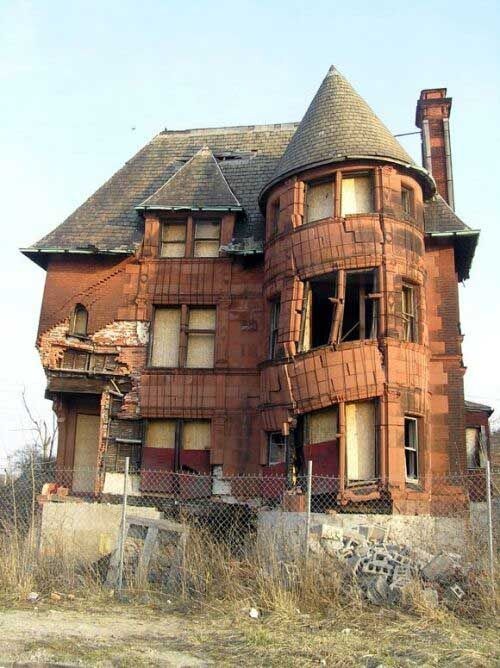
Just what makes a building bad?  The traditional 3 criteria for evaluating architecture are: “firmness, commodity, and delight,” (in other words, structural stability, appropriate functionality, and attractive appearance).  When some or all of these things are not achieved, it’s bad.

Bad-Architecture-009Bad because it lacks firmness.
It’s going to fall down.
Everyone can agree.

 driveway_steep

Bad because it lacks commodity.
It won’t work as it should.
Everyone can agree.

 ponte-johannesburg_2159772k Bad because of lack of delight.

It’s ugly.

That’s just my opinion; others may disagree.

This is the Ponte City Apartments in Johannesburg. I think it’s ugly for the following reasons:

  • It lacks rhythm and differentiation.
  • The pattern of windows and concrete is completely predictable all the way up.
  • The big sign on top is commercial and cheap-looking.
  • It’s massive and clumsy compared to everything around it.

There are many websites devoted to bad/ugly architecture.  Several are listed below.  You won’t be disappointed when you visit these sites!

Do you agree that all of the projects deserve scorn?  You may find that you like some of them.  What are the reasons you find them good or bad?

1st photo courtesy of Funzu.com; 2nd photo courtesy of International Assoc. of Home Inspectors; 3rd photo courtesy of Alamy.

Feel free to share any of these images, but please provide a link back to 2H Pencil.

I invite your comments.

Architecture Whisperer, No. 3

Behold, the building speaks! It says, “We are great and powerful. You are small and meek. Any questions?

italianbank_2259212b

At the end of piazza Salimbeni in Sienna Italy, the bank Monte dei Paschi stands like a fortress.  In 1472, this palazzo was converted into a bank; it is the oldest bank in the world.  The institution relies on its reputation for stability and security, which are embodied by the building. The façade wall’s upper crenellated edge was designed for defense. The single doorway within a Gothic arch, placed off-center at street level, is intimidatingly enormous and exposed.

bank door

Upon closer observation, the large-scaled pair of bronze-bedecked doors contain a single human-scaled door.  The imposing building has made a concession to its users, allowing them passage, but at the same time reminding them that The Bank is formidable, and controls everything that comes and goes from its premises.

Architects manipulate scale to influence perception.

Edith Ann

In relation to large things, we feel small and powerless.

img_half_scale_cars In relation to small things, we feel big and powerful.

 Comfort-Chairs-Created-by-Cate-and-Nelson-Photos8In relation to human-scale things, we feel just right.

1st image courtesy of The Telegraph, 2nd image courtesy of Gimbo, 3rd Image courtesy of the Lily Tomlin & Jane Wagner Website, 4th image courtesy of Harrington Group, 5th image courtesy of Cate&Nelson.

Feel free to share any of these images, but please provide a link back to 2H Pencil.

I invite your comments.