I’ve been going through the slides from my family’s past to figure out what to do with them and how to do it. My Dad was a diligent photographer, shooting quantities of slides, stills, and movies. When I was a child, he had a darkroom for black and white processing. I spent many hours in there with him and later, on my own. I remember well: “When the little red light by the entrance is on, don’t go in!” In the process of reviewing the slides, I am enjoying the opportunity to see the world through my Dad’s eyes– what interested him, what he focused on, what he thought was significant.
 We’ve got a lot of slides.
My task is to cull the images that I think will be of significance to current and future generations, and to discard the others. Each slide will be considered in these terms. The “keepers” will be digitized and stored on a dedicated portable drive, and then opened on my graphic design software, where I can quickly rotate, crop, and adjust the color, contrast, and/or brightness of each. I’ll figure out a way to present a streamlined version of the best images for my family members. It’s a big job; I expect it to take a couple of years.
The batch I have been working with tonight are of a trip my parents took to Turkey in 1973. The 40-year-old slides have undergone some physical changes over time (haven’t we all!), and their color is uniformly distorted. I can correct the color when there are people in the shot. However, in this batch of slides, most of the images are of scenery, buildings, and ruins. I’ve got no reference point about the “real” color except the software’s auto correct semblance of the actual colors, which is only a computer code-driven guess.
In their unretouched form, the color distortion makes the scenes surreal and compelling, perhaps even more so than what is “correct” or “true.” It adds additional other worldliness to a world that is already “other” to me.
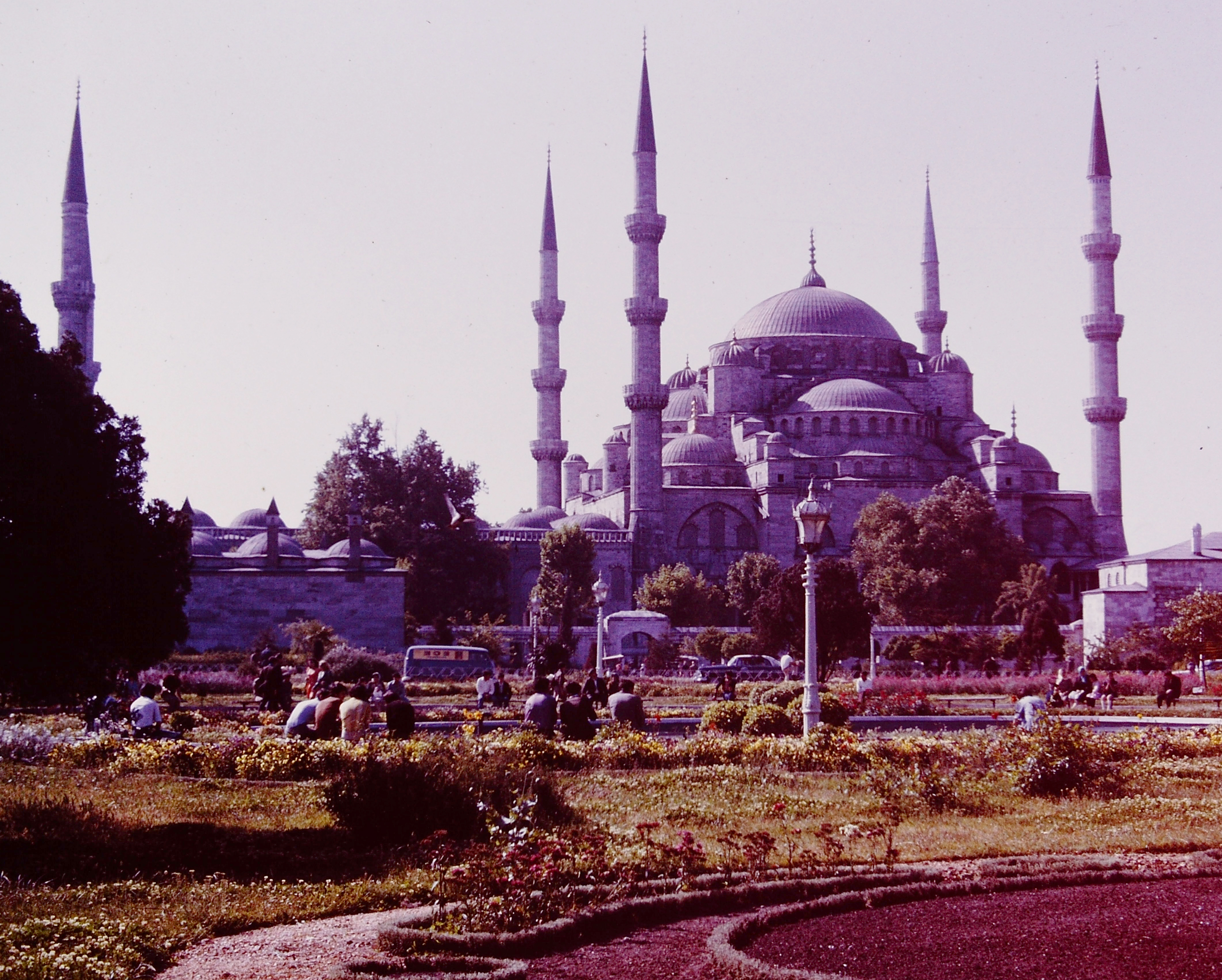
 The slide’s age turned the mosque this luminous purple.
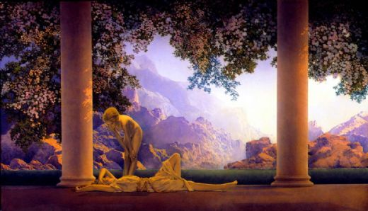
 The colors and the atmosphere in the mosque image are not so different from those above in “Daybreak,” by painter/illustrator Maxfield Parrish in 1922.
 Unretouched, exceptionally vibrant and emphatically colored shot, taken from a position seated on the floor.
 Cool car, interesting loose urban density, some expected colors, and some weird colors.
 Unretouched image inside mosque.
 Color adjusted to what might be “real.”
 Color correction by software to remove red cast of original.
 Manipulated, and starting to look like a textile.
 This unretouched image of a ruin in an arid landscape is, in fact, upside down.
 Unretouched image of ruins, looking like a parched otherworldly landscape at sunset. the color palette reminds me of Pre-Raphaelite paintings like this one (I’ve only seen the reproduction, not the actual thing), in which color is used to evoke physical and emotional feelings:
 John Everett Millais, Chill October, 1870
 Unretouched composition, with the base of a gold finial touching the frame at the top. Dad sometimes framed his shots with the tops of people’s heads or tops of buildings cut off, but in this case, it makes a great composition. The negative space of the blue sky is lovely to me.
All Images courtesy of Alan Kraft, with interventions by me.
Feel free to share any of these images, but please provide a link back to 2H Pencil.
I invite your comments.