Analog Perfection
1

Australian architect Glenn Murcutt on drawing by hand.
As summer’s yard work draws to a close, I offer the following garden-related “notes-to-self” that have been scribbled in my journal during the season.

fatsia berries
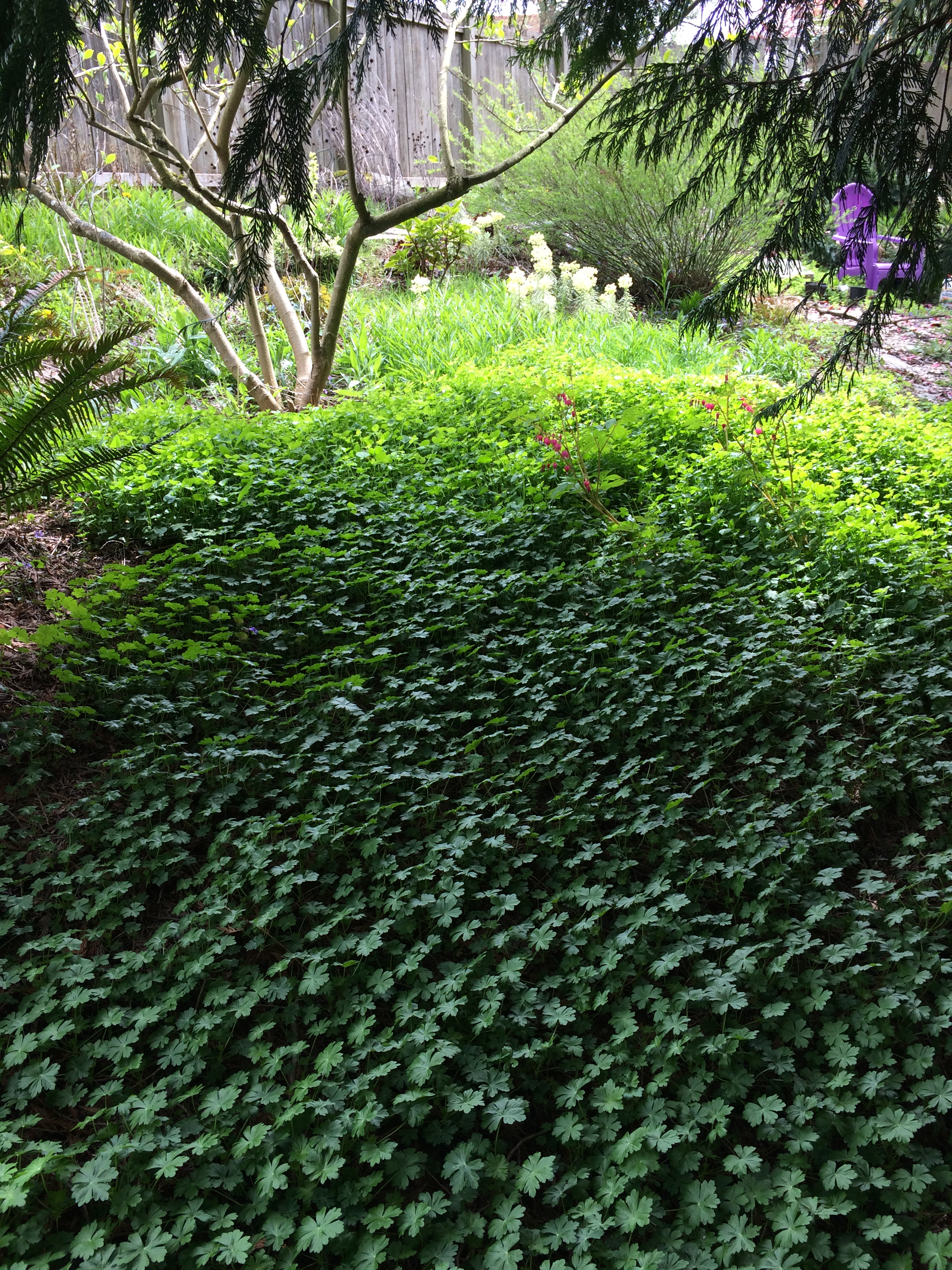


All photos by Laura Kraft.
Feel free to share the content of this posting, but please provide a link back to 2H Pencil.


A garden constantly changes over time. So, too, does the gardener. And (lately), so does the climate. After 3 decades of tending my lush and ever-bearing yard, it was time to re-think its current design. There was little to limit my imagination except the limits of my physical ability and my time.
I approached the design similarly to the way I approach any architectural design project, with a progression of phases.


Phase 2. Gather Facts About Prevailing Conditions.
Over the years, I have developed a head full of experience and opinions about this garden’s performance.
The hardscape (paths, stairs, retaining walls, and paved areas) has been developed over the years. It will essentially remain as-is.
I have noted plantings that have succeeded and those that failed. Some of them combine with others. Some are easy to care for. Some offer great rewards, such as long blooming time, delicious scents, beautiful colors, and/or striking textures.
On the other hand, others are short-lived, invasive, fussy, too chaotic, or I just don’t like them.
I made the following double-duty diagram.
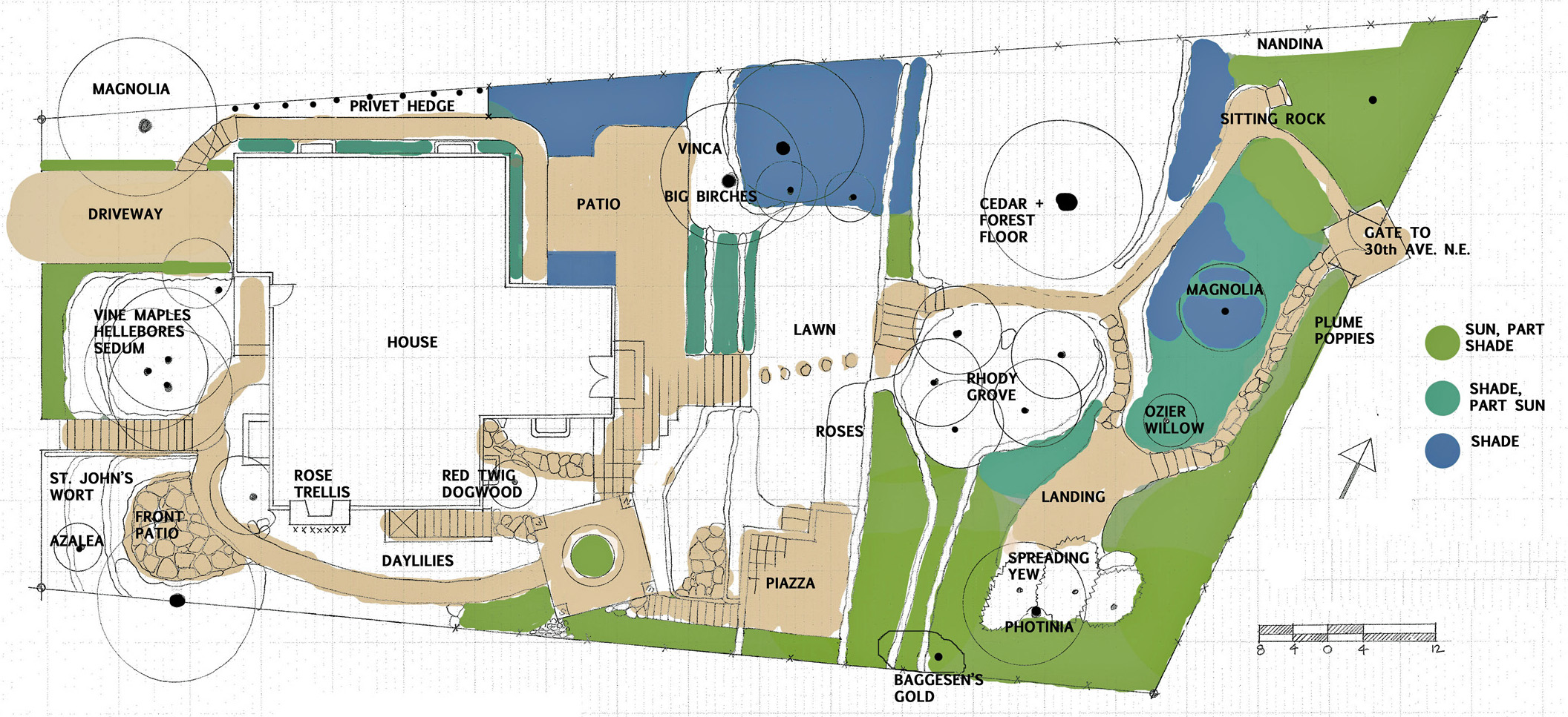
Examples of elements well worth keeping as-is:


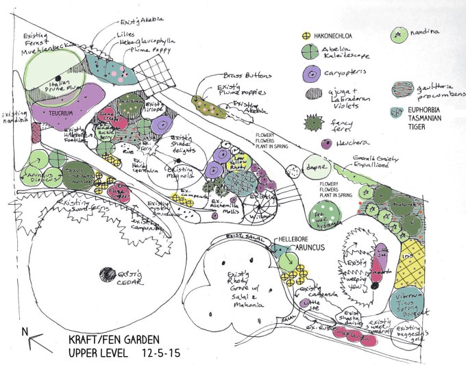
Phase 3. Scheme, daydream, and imagine possibilities. Start wish lists, accompanied by deep research in books and on the web. Some of my lists:

At the end of this third phase, armed with information and ideas, I am ready to start drawing.
Doing Garden Design, Part 2: Plans
Feel free to share the content of this posting, but please provide a link back to 2H Pencil.
A while back, when I taught art in a high school, I conducted an experiment in moving lines from the paper into the air. In the library, we researched and made line drawings of insects and other small creatures. The next day, using wire and pliers, we manipulated the lines in space. It was fun! The unclaimed 3D line drawings ended up on my mantle at home.

I appreciate their embodied energy, and their economical structural integrity .


Recently, I obtained a 3Doodler 2.0, a device which enables one to create lines in the air using molten ABS plastic, the stuff of Legos.

In theory, this new toy presents a vast array of opportunities. In reality, first, there is a learning curve. I will have to internalize:

My first efforts: pyramids. I’ve got a long way to go.
A recent review notes the following:
“Honestly, you’re not going to make many practical, functional, or truly useful objects with 3Doodler … it’s really just a fun artistic tool. If you’re looking for a legit 3D printer that you can make useful objects with, you should definitely look elsewhere…
That said, if you like the idea of drawing objects in three dimensions, without having to jump over all the hurdles that lie between ideation and creation (like software, computer models, and properly calibrated machinery) then the newest 3Doodler should definitely be in your artist’s toolkit.”
I look forward to making some objects. Perhaps they will be models of conceptual products. As likely, they will be one-offs. Or is that ones-off?
Feel free to share the content of this posting, but please provide a link back to 2H Pencil.
 Mass-market example of a rarely seen seven-sided shape, the heptagon.
Feel free to share the content of this posting, but please provide a link back to 2H Pencil.
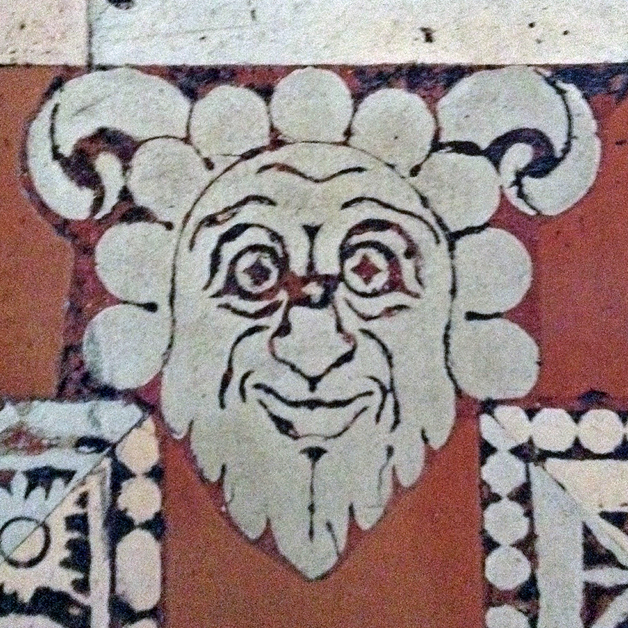
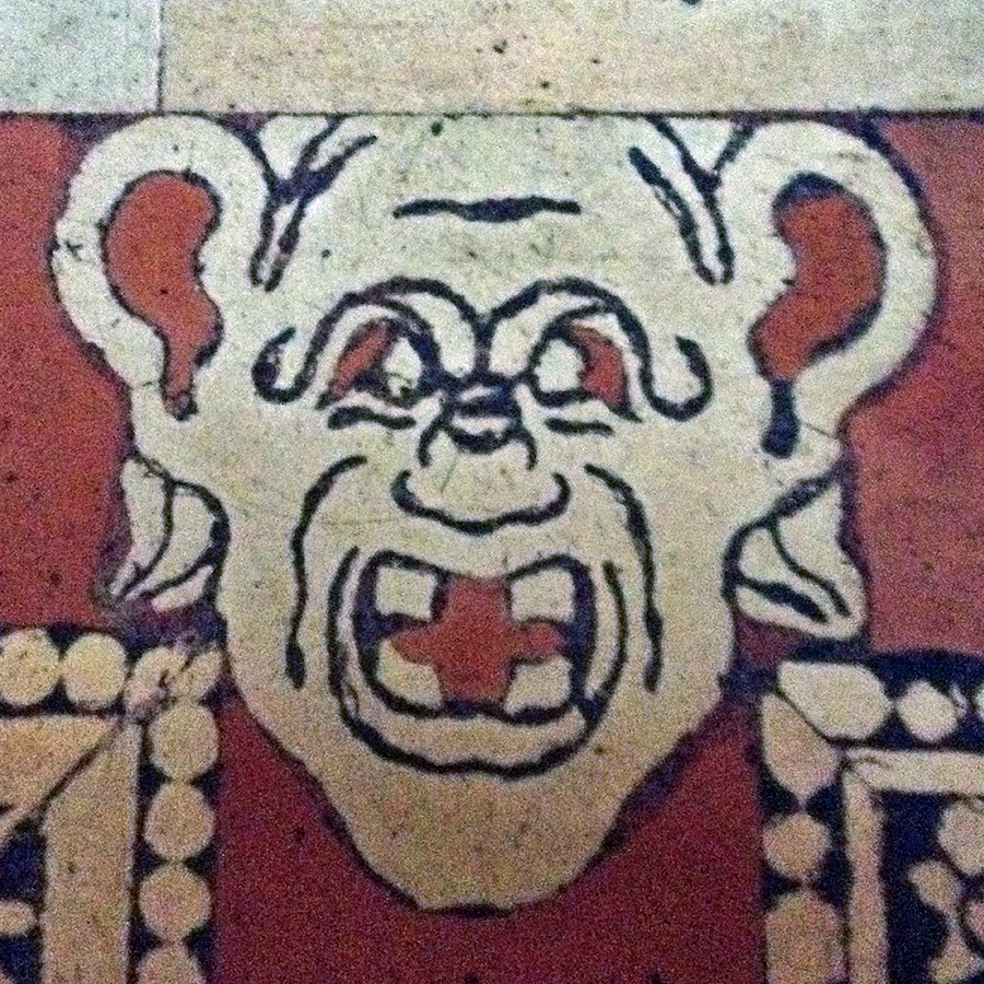
This post is an answer to question posed in the previous blog post:
Q. “Who are we?”
A. We are grotesques, inlaid into the terra cotta floor of the Reading Room in the Laurentian Library, in Florence, Italy.
 The Library’s Entry Vestibule and Reading Room were designed by Michelangelo. They are notable because of the radical ways in which architectural elements are used without strict adherence to their traditional/ expected/functional roles. The tall vestibule, an interior room, is made to feel like an outdoor courtyard, literally outside-in. There are large corbels (brackets) that don’t physically hold anything up, and window-frames surrounding planes of opaque stone rather than glass.
It is a prime example of the style called Mannerism. From Wikipedia, “Mannerism is notable for its intellectual sophistication as well as its artificial (as opposed to naturalistic) qualities. Mannerism favors compositional tension and instability rather than the balance and clarity of earlier Renaissance (work).”
I had been taught that the Laurentian Library was both conceived of and fleshed out by Michelangelo. Because of this, I thought that the faces inlaid in the floor were made from sketches by Michelangelo. However, in a correspondence with Leonard Barkan, a scholar, currently at Princeton University, with many deep interests including Literature, History, Art History, Classics, and Meaning, I learned that this was not the case. He wrote:
The faces on the floor of the Laurentian Library are indeed interesting, in the fashion of grotteschi, which were a widely diffused style of decoration throughout the sixteenth century and beyond. They probably don’t have much to do with Michelangelo himself. The Library was realized from what appear to have been his very generalized architectural designs, but he seems to have had very little input as regards the details, since it was all done after he had definitively left Florence. And the letters we possess on the subject suggest that he wasn’t very closely connected with what was going on in the construction. The drawings for the floor were (we’re told) by Niccolò Tribolo. For a brief account in English, see: http://www.bml.firenze.sbn.it/ing/tour_of_the_complex.htm
The inclusion of this assortment of cartoon-like heads in this stately space may have been done in order to include the wild, sensuous, and willful side of human nature along with the sublime, intellectual and religious side.
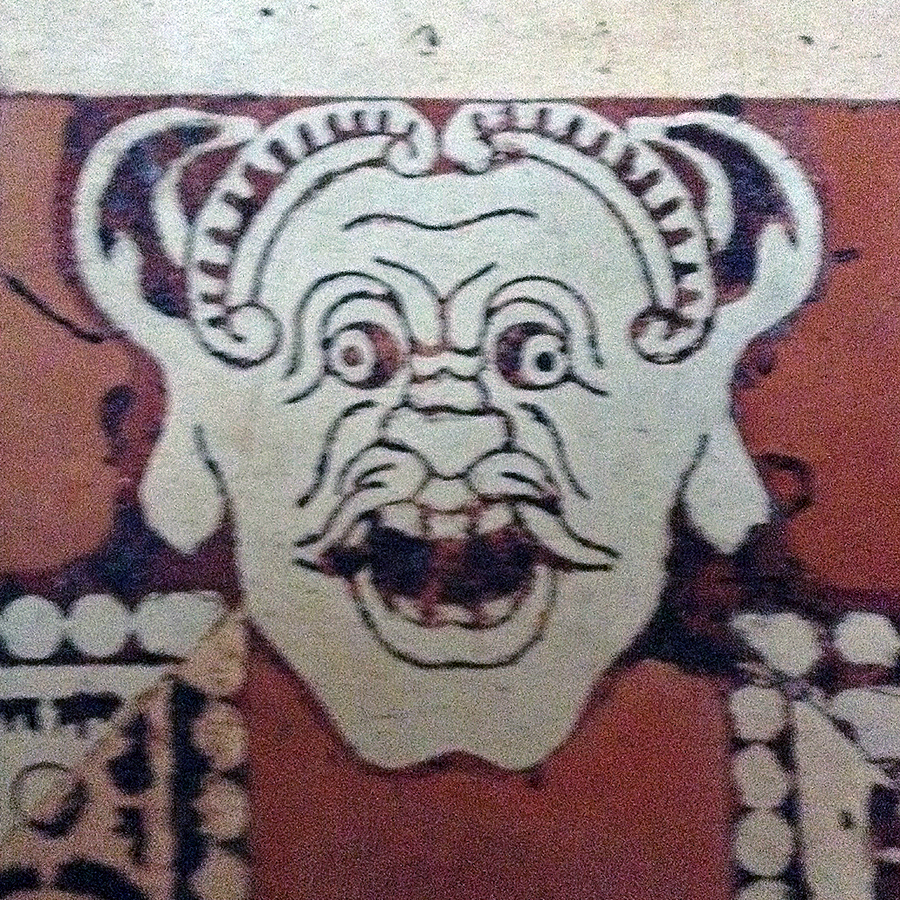
Grotesques are found in architecture throughout the world. The following Gothic examples are from the Bayeux Cathedral, in Bayeux France.


Bayeux images courtesy of George P. Landow
Feel free to share the content of this posting, but please provide a link back to 2H Pencil.
I’ve been going through the slides from my family’s past to figure out what to do with them and how to do it. My Dad was a diligent photographer, shooting quantities of slides, stills, and movies. When I was a child, he had a darkroom for black and white processing. I spent many hours in there with him and later, on my own. I remember well: “When the little red light by the entrance is on, don’t go in!” In the process of reviewing the slides, I am enjoying the opportunity to see the world through my Dad’s eyes– what interested him, what he focused on, what he thought was significant.
 We’ve got a lot of slides.
My task is to cull the images that I think will be of significance to current and future generations, and to discard the others. Each slide will be considered in these terms. The “keepers” will be digitized and stored on a dedicated portable drive, and then opened on my graphic design software, where I can quickly rotate, crop, and adjust the color, contrast, and/or brightness of each. I’ll figure out a way to present a streamlined version of the best images for my family members. It’s a big job; I expect it to take a couple of years.
The batch I have been working with tonight are of a trip my parents took to Turkey in 1973. The 40-year-old slides have undergone some physical changes over time (haven’t we all!), and their color is uniformly distorted. I can correct the color when there are people in the shot. However, in this batch of slides, most of the images are of scenery, buildings, and ruins. I’ve got no reference point about the “real” color except the software’s auto correct semblance of the actual colors, which is only a computer code-driven guess.
In their unretouched form, the color distortion makes the scenes surreal and compelling, perhaps even more so than what is “correct” or “true.” It adds additional other worldliness to a world that is already “other” to me.
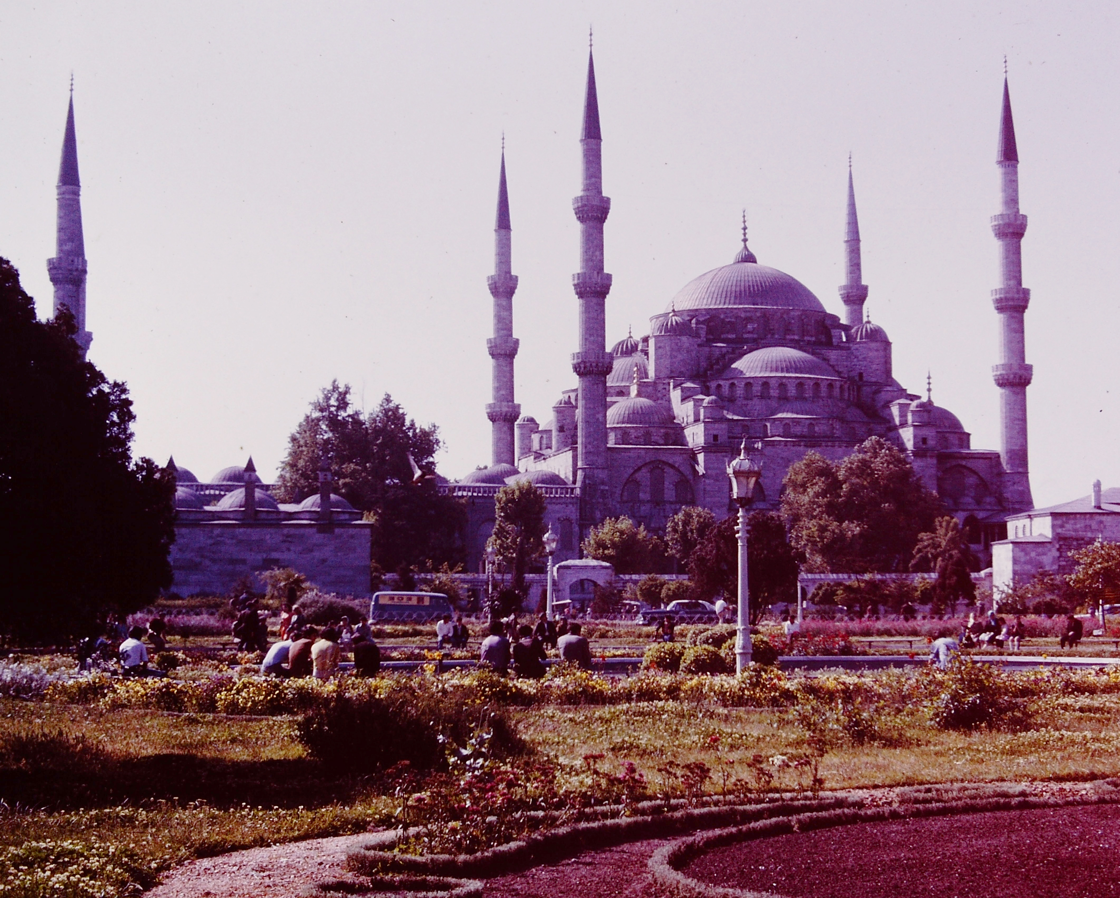 The slide’s age turned the mosque this luminous purple.
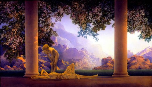 The colors and the atmosphere in the mosque image are not so different from those above in “Daybreak,” by painter/illustrator Maxfield Parrish in 1922.
 Unretouched, exceptionally vibrant and emphatically colored shot, taken from a position seated on the floor.
 Cool car, interesting loose urban density, some expected colors, and some weird colors.
 Unretouched image inside mosque.
 Color adjusted to what might be “real.”
 Color correction by software to remove red cast of original.
 Manipulated, and starting to look like a textile.
 This unretouched image of a ruin in an arid landscape is, in fact, upside down.
 Unretouched image of ruins, looking like a parched otherworldly landscape at sunset. the color palette reminds me of Pre-Raphaelite paintings like this one (I’ve only seen the reproduction, not the actual thing), in which color is used to evoke physical and emotional feelings:
 John Everett Millais, Chill October, 1870
 Unretouched composition, with the base of a gold finial touching the frame at the top. Dad sometimes framed his shots with the tops of people’s heads or tops of buildings cut off, but in this case, it makes a great composition. The negative space of the blue sky is lovely to me.
All Images courtesy of Alan Kraft, with interventions by me.
Feel free to share any of these images, but please provide a link back to 2H Pencil.
I invite your comments.