I’ve been enthusiastically making prints lately! Please check them out at this link:
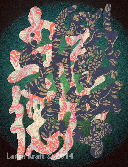
All Images courtesy of Laura Kraft.
Feel free to share any of these copyright-protected images, but please provide a link back to 2H Pencil.
I invite your comments.

The impulse to challenge users and viewers has long been at the heart of trompe l’oeil (fool the eye) projects. When the eye sees something, the body believes it.
Two-dimensional patterns (made with tiles, carpet, paint, or…..) can create the optical illusion of three dimensionality.

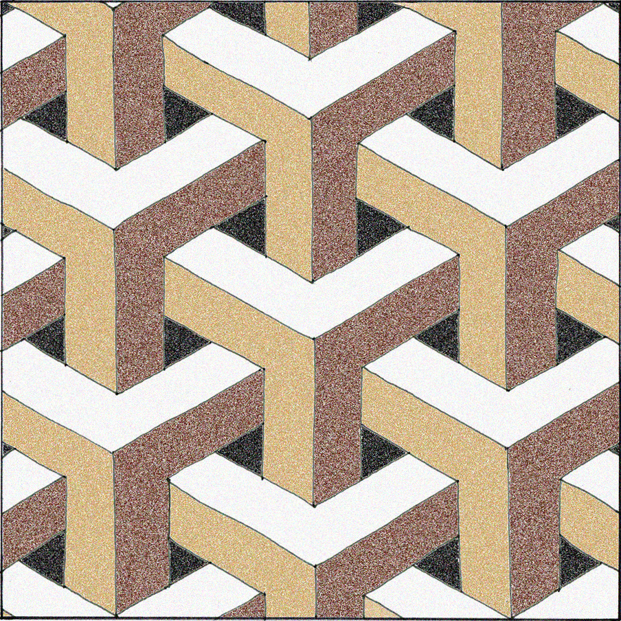
In the pattern above, do you see stacked cubes with white tops? Or white bottoms? Does the image change back and forth for you?

Here, the colors are rearranged. Is the white surface the top, right, left, or bottom of the cube?
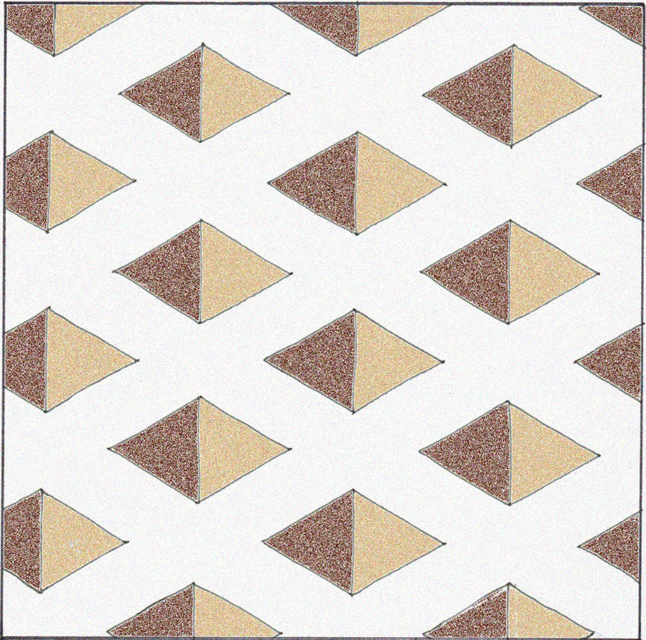
Does this pattern look flat or 3-D? Do you see square holes or pyramids?
Is this arrangement actually possible in three dimensions?

This sketch of the floor pattern at the Accademia Museum in Venice shows square “recesses” in the medallion on the right, anchored in a flat peach-colored field. The 3-D illusion is contained, and I don’t fear falling through this floor.

Would this give you vertigo?

Would this stair landing make you pause before walking on it?
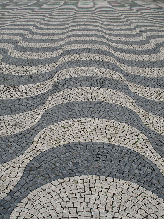
Can you feel the surface ripple?

Does this (actually flat) carpeting make you want to stagger? Or worse?

A computer-generated tile design clads these perfectly flat and plumb surfaces. Architect Thom Faulders‘ client said, “I wanted someone to barf when they look at it.” This illusion, versus the reality of its flatness, comes close!
The first five drawings were made by me. The first and second photos’ attributions are TBD; the third photo is courtesy of George Winteringham, via Patternity; the fifth photo is courtesy of Vurdlak; the sixth photo is courtesy of Thom Faulders.
Feel free to share the content of this blog, but please provide a link back to 2H Pencil.
I invite your comments.
My clients, Ed and Laurel were adamant: they wanted their house to have lot of color and as much handcraft as they could afford. They are great fans of the work of the Spanish architect Antoni Gaudi. They love the ad hoc nature of his tile installations where the workers, collaborating with Gaudi, made the mosaics come to life.
 mosaic walls at Barcelona’s Parc Güell
 Clearly, and excitingly, some elements of this work could not have been planned. They grew out of the process.
The social and economic conditions that made Gaudi’s work possible don’t exist here and now. And yet, within constraints of a modest budget and a remote rural location, my design directive from Ed and Laurel was, “Capture something of the spirit of Gaudi. Let color happen.”
 This is the flooring in one room of Ed and Laurel’s house. Each room has its own color “personality.” For each room and the front foyer, four colors of standard vinyl tile were selected, and then cut (in the shop) on a diagonal. They were then installed in pattern that is random, except that no color may abut itself, so it’s “almost random.”
 A conceptual floor plan sketch shows an early version of the color layout. The foyer has soothing water colors of blue, purple and green.
 transition from Foyer to Multi-Purpose Room
 Transition from Foyer to Kitchen
Ed and Laurel are happy with their house.
 contented basking lizard at Parc Güell
First image courtesy of Bing Images, second image courtesy of traveladventures.org, last image courtesy of entertainmentdesigner.com.
All other images belong to Laura Kraft-Architect. Feel free to share any of these images, but please provide a link back to 2H Pencil. Thanks.
I recently had a chance to teach a few classes about architecture and design to some bright 5th graders. They were excited by the following demonstration. First, we looked at these yellow columns:
 Then we looked again, with a hint: LOOK AT THE SHAPES OF THE SPACES BETWEEN THE COLUMNS. This brought on gasps of recognition and laughter. The negative space popped into the foreground and became the forms of people.
The moment when perception changes is jarring and provocative. The two different sets of information, once discerned, compete for foreground status.
Positive and negative space can provide an interesting lens with which to look at plans of buildings and towns. The gray shapes are the buildings in Martina Franca, an Italian town founded around 1300. Those with crosses drawn on them are churches. Interesting that there is barely a rectangular shape to be found.
 To get a different perspective, reverse the positive and negative, and focus on the branching circulation paths. The wider parts are the gathering places. This image (below) showing the twisting streets, the dead ends, and the irregularly shaped plazas, gives an insight into what it was like to get around this town.
 When designing a building or group of them, it is useful and informative to “pop” the shape of the circulation space into the foreground and look at it as a thing in its own right. It’s not just leftover square footage—it’s the connective tissue of the experience of the place.
First image courtesy of coolopticalillusions.com. Town plans adapted from “Streets for People,” by Bernard Rudofsky.
Feel free to share any of these images, but please provide a link back to 2H Pencil. Thanks.
This is the floor in a basement kitchen of a house in NW Washington DC. As the story goes, at one time, the house belonged to a tile setter.

The tile setter brought home tiles left over from his jobs. He laid out patterns and combinations based on the tiles he happened to have on hand. He allowed himself to try things, without the yoke of rules, just to see what they looked like. He allowed his work to be imperfect. He let his children try their hands at his craft.
 The resulting floor is remarkable. It is like a patchwork quilt. Each patch is an interesting composition in its own right. The overall combination is delightfully unselfconscious and lively.
All images belong to Laura Kraft-Architect. Feel free to share any of these images, but please provide a link back to 2H Pencil. Thanks.
