Illusions, No. 2

The impulse to challenge users and viewers has long been at the heart of trompe l’oeil (fool the eye) projects. When the eye sees something, the body believes it.

Two-dimensional patterns (made with tiles, carpet, paint, or…..) can create the optical illusion of three dimensionality.

Image

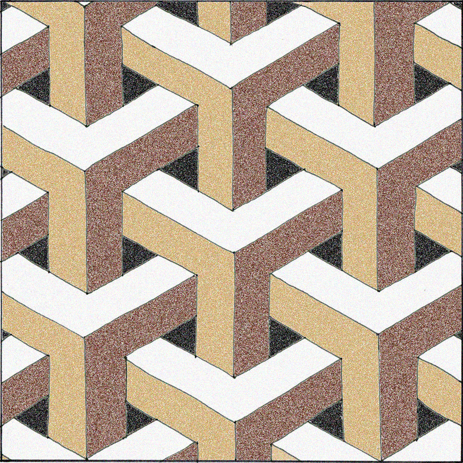
In the pattern above, do you see stacked cubes with white tops? Or white bottoms?  Does the image change back and forth for you?

pattern 7

Here, the colors are rearranged. Is the white surface the top, right, left, or bottom of the cube?

Image

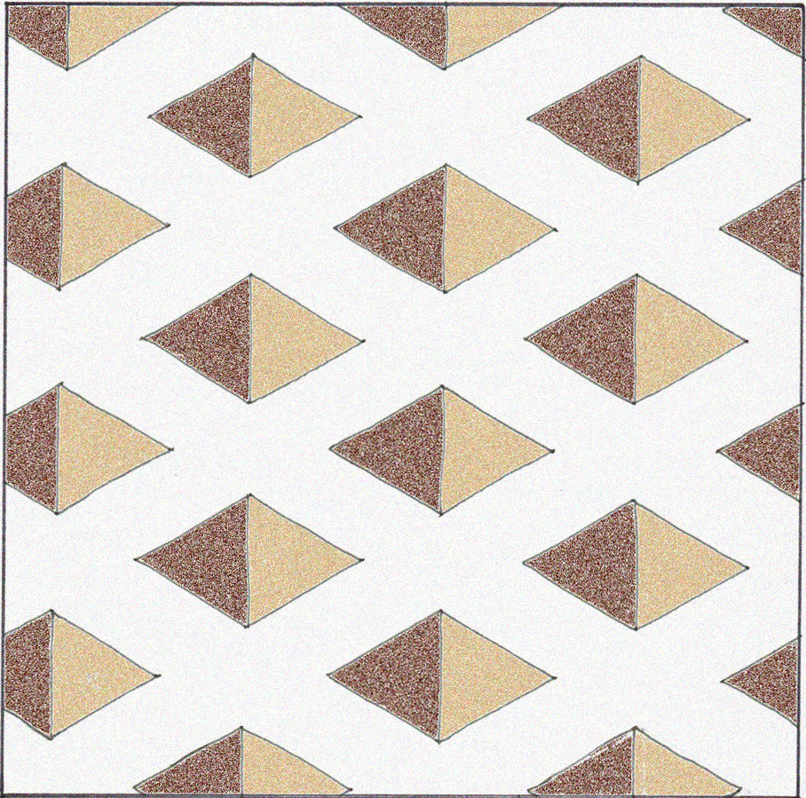
Does this pattern look flat or 3-D? Do you see square holes or pyramids?

Pattern 2

Is this arrangement actually possible in three dimensions?

L Accademia

This sketch of the floor pattern at the Accademia Museum in Venice shows square “recesses” in the medallion on the right, anchored in a flat peach-colored field.  The 3-D illusion is contained, and I don’t fear falling through this floor.

82962747_4cb33a8ac4

Would this give you vertigo?

Golden_Staircase400

Would this stair landing make you pause before walking on it?

GEORGE-WINTERINGHAM_LISBONPAVING3

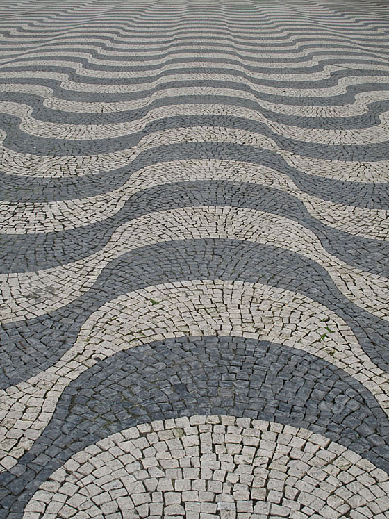
Can you feel the surface ripple?

3D-Optical-Illusion-Carpet

Does this (actually flat) carpeting make you want to stagger? Or worse?

warped

A computer-generated tile design clads these perfectly flat and plumb surfaces. Architect Thom Faulders‘ client said, “I wanted someone to barf when they look at it.” This illusion, versus the reality of its flatness, comes close!

The first five drawings were made by me. The first and second photos’ attributions are TBD; the third photo is courtesy of George Winteringham, via Patternity; the fifth photo is courtesy of Vurdlak; the sixth photo is courtesy of Thom Faulders.

Feel free to share the content of this blog, but please provide a link back to 2H Pencil.

I invite your comments.

Accentuate the Negative

I recently had a chance to teach a few classes about architecture and design to some bright 5th graders.  They were  excited by the following demonstration.  First, we looked at these yellow columns:

Then we looked again, with a hint:  LOOK AT THE SHAPES OF THE SPACES BETWEEN THE COLUMNS.  This brought on gasps of recognition and laughter. The negative space popped into the foreground and became the forms of people.

The moment when perception changes is jarring and provocative. The two different sets of information, once discerned, compete for foreground status.

Positive and negative space can provide an interesting lens with which to look at plans of buildings and towns. The gray shapes are the buildings in Martina Franca, an Italian town founded around 1300. Those with crosses drawn on them are churches. Interesting that there is barely a rectangular shape to be found.

To get a different perspective, reverse the positive and negative, and focus on the branching circulation paths. The wider parts are the gathering places. This image (below) showing  the twisting streets, the dead ends, and the irregularly shaped plazas, gives an insight into what it was like to get around this town.

When designing a building or group of them, it is useful and informative to “pop” the shape of the circulation space into the foreground and look at it as a thing in its own right.  It’s not just leftover square footage—it’s the connective tissue of the experience of the place.

First image courtesy of coolopticalillusions.com. Town plans adapted from “Streets for People,” by Bernard Rudofsky.

Feel free to share any of these images, but please provide a link back to 2H Pencil.  Thanks.