The Color of Light

Enjoying the good fortune to be in Vernazza, Italy a few years ago, on a May morning after breakfast,  I did this watercolor sketch of the waterfront. The early light had a blue tinge. I saw slightly gray colors. The forms were softened, as if by a haze.

Later that afternoon around three o’clock, I sat in the same spot and resumed painting the waterfront. The building at the far right of the first painting is more or less the same as that on the far left of the second one.

At this hour, the light had a warm cast.  The forms were sharp, colors saturated, contrasts high.

Light changes color and character continuously during the course of a day. One of the pleasures of painting outdoors is being mindful of the color of light, and capturing a moment in time.

All images belong to Laura Kraft-Architect. Feel free to share any of these images, but please provide a link back to 2H Pencil. Thanks.

Architecture Whisperer, No. 2

Behold, the building speaks! This one says, “Take that, you stodgy old status quo.

The Experience Museum Project (EMP), also known as the Rock and Roll Museum, is a brash mashup of metallic forms, a one-of-a-kind building set in the predominantly mid-century architecture of the 1962 World’s Fair Grounds in Seattle, now known as Seattle Center.

Rock and roll, since its inception, has gone through continuous evolution of pushing the mainstream’s comfort envelope. When it first arrived on our shores, it was considered obnoxious, if not scandalous by adults, and seductive by the young.

The early Beatleshair was regarded as radical because, compared to the prevailing norm, it was long and tousled, though in today’s context it looks positively tame.

A generation gap ensued in part because adults recoiled as young people embraced the genre. Similarly, critics recoiled when the EMP was constructed. From the Wikipedia article on the EMP:

Frank Gehry,” remarked British-born, Seattle-based writer Jonathan Raban, “has created some wonderful buildings, like the Guggenheim Museum in Bilbao, but his Seattle effort, the Experience Music Project, is not one of them.” New York Times architecture critic Herbert Muschamp described it as “something that crawled out of the sea, rolled over, and died.” Forbes magazine called it one of the world’s 10 ugliest buildings.Others describe it as a “blob” or call it “The Hemorrhoids”.

The architect and builders went to great pains and great expense to make a building seemingly without straight lines, vertical planes, or neutral colors, subverting our understanding of what “normal” buildings are like.

The EMP is says “I was born to be wild.” Like rock and roll, it is loud and not easy to ignore. It is flamboyant. Its metallic surface has psychedelic shifting colors and reflections. It gets much of its power from its sheer novelty. Like rock and roll.

To this day, it is the only building of its kind in our city.  It’s no longer as shocking to us as it was at first, though it is hard to imagine a time in the future when this boisterous object will simply blend into the background. After a dozen years since it opened, it continues to attract attention with its tremendous energy and presence.

I think other buildings fantasize about letting it all hang out, and being the EMP.

First image courtesy of Zahner metal fabricators; second image courtesy of Wikipedia; third and fourth images courtesy of Zahner metal fabricators.

 Feel free to share any of these images, but please provide a link back to 2H Pencil.  Thanks.

Let Color Happen

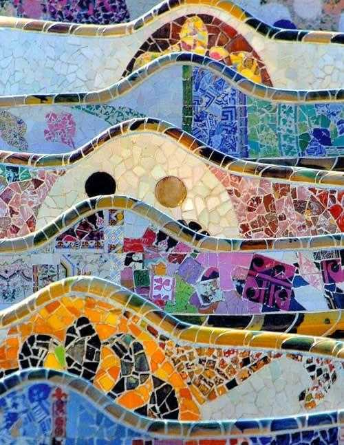
My clients, Ed and Laurel were adamant: they wanted their house to have lot of color and as much handcraft as they could afford. They are great fans of the work of the Spanish architect Antoni Gaudi. They love the ad hoc nature of his tile installations where the workers, collaborating with Gaudi, made the mosaics come to life.

mosaic walls at Barcelona’s Parc Güell

Clearly, and excitingly, some elements of this work could not have been planned. They grew out of the process.

The social and economic conditions that made Gaudi’s work possible don’t exist here and now. And yet, within constraints of a modest budget and a remote rural location, my design directive from Ed and Laurel was, “Capture something of the spirit of Gaudi. Let color happen.”

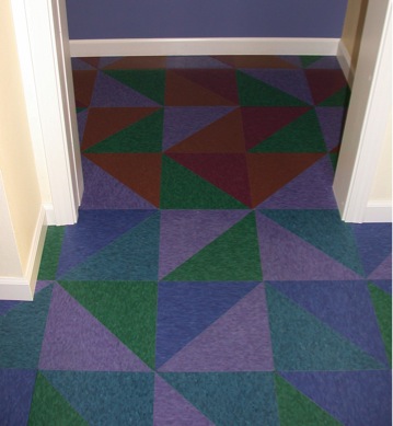
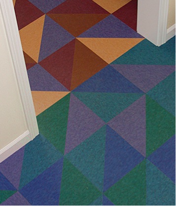
This is the flooring in one room of Ed and Laurel’s house. Each room has its own color “personality.” For each room and the front foyer, four colors of standard vinyl tile were selected, and then cut (in the shop) on a diagonal. They were then installed in pattern that is random, except that no color may abut itself, so it’s “almost random.”

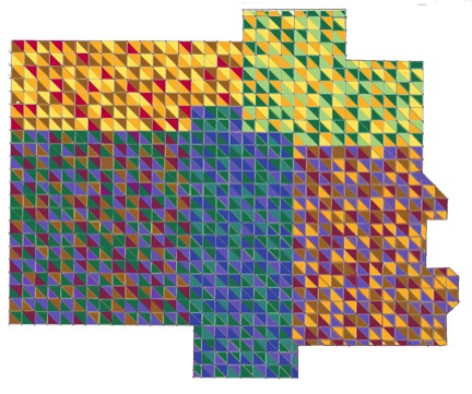
A conceptual floor plan sketch shows an early version of the color layout. The foyer has soothing water colors of blue, purple and green.

transition from Foyer to Multi-Purpose Room

Transition from Foyer to Kitchen

Ed and Laurel are happy with their house.

contented basking lizard at Parc Güell

First image courtesy of Bing Images, second image courtesy of traveladventures.org, last image courtesy of entertainmentdesigner.com.

All other images belong to Laura Kraft-Architect. Feel free to share any of these images, but please provide a link back to 2H Pencil. Thanks.

Architecture Whisperer, No. 1

Behold, the building speaks! This building says, “OUCH!

The Shooting Venue for the 2012 London Olympics has a tensile fabric skin with scattered protruding colored portals.

One of two things have caused these angry lesions. The building may have been assaulted with deadly force by the shooting competitors within.

Metal surface scarred by bullets coming through from the other side.

On the other hand, it is possible that the building is screaming for Calamine Lotion. Lots of it. NOW.

1st image courtesy of  Magma Architecture, 2nd image rendered using “bullet hole brushes” in Adobe PSE, 3rd image courtesy of Current TV

 Feel free to share any of these images, but please provide a link back to 2H Pencil.  Thanks.