Doing Garden Design, part 4: Results Are In

Six years have passed since my garden remodel process started.  They say that it takes at least three years for perennial plantings to begin living their best life. Most of the new plants are in their fifth year, and are now well established.

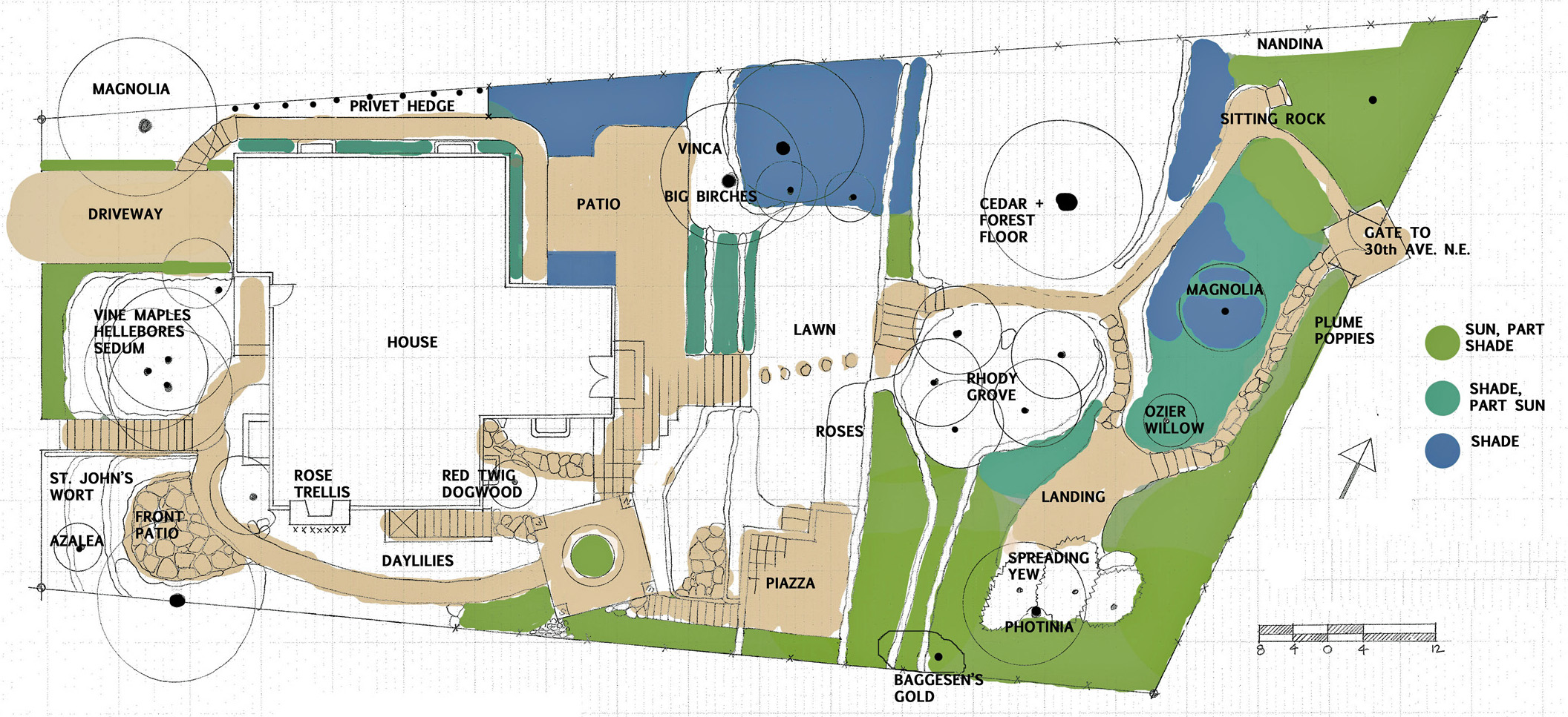
As with any architectural project, now that it has been realized, I can evaluate how the design meets my original goals, which were to have larger drifts of fewer, more thoughtfully placed, more evergreen, and more drought tolerant plants. I wanted to brighten the shady places. 

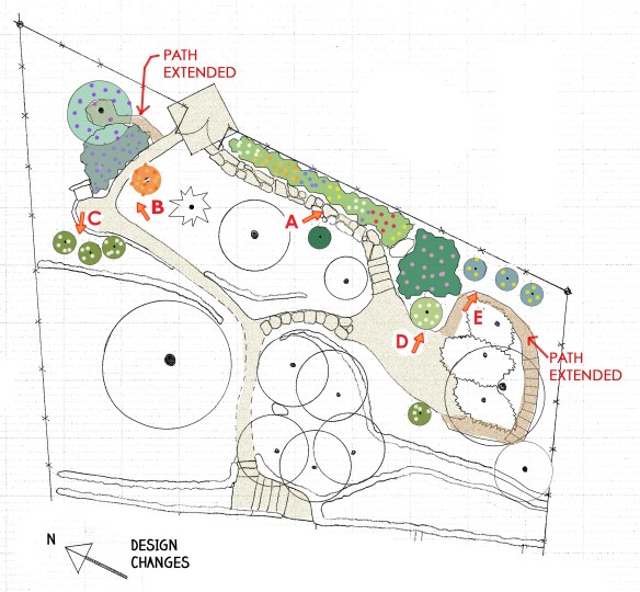
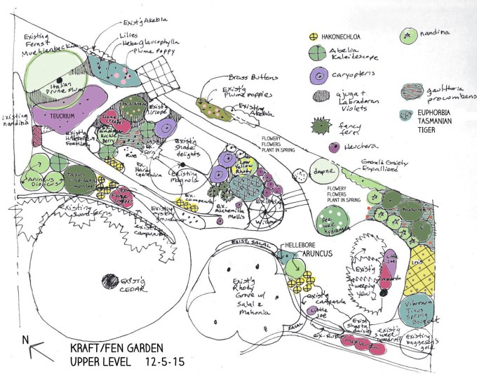
Here are some instances which correlate strongly to the goals.

A

“A new “flowery flower” area along the upper path in a sunny stretch is full of color from spring through fall. I added drip irrigation here, which made all the difference for the success of these plants.

B

In the upper left corner, an abelia ‘kaleidoscope’ provides an ever changing show of color. Beyond it, on the far side of the path, a large drift of evergreen germander with late-summer purple flowers has filled in nicely. Beyond it, the new Italian prune plum tree started yielding plums last year!

C

Goatsbeard brightens an area of full shade. One of the three didn’t make it, so it was replaced (in green cage). Wonderful surprise: the hellebore in the left foreground is a volunteer from a nearby clump.

D

A new dwarf hydrangea sparkles at a shady turn of the path. Sweet woodruff forms a carpet underfoot. Spotted lamium adds contrasting foliage.

E

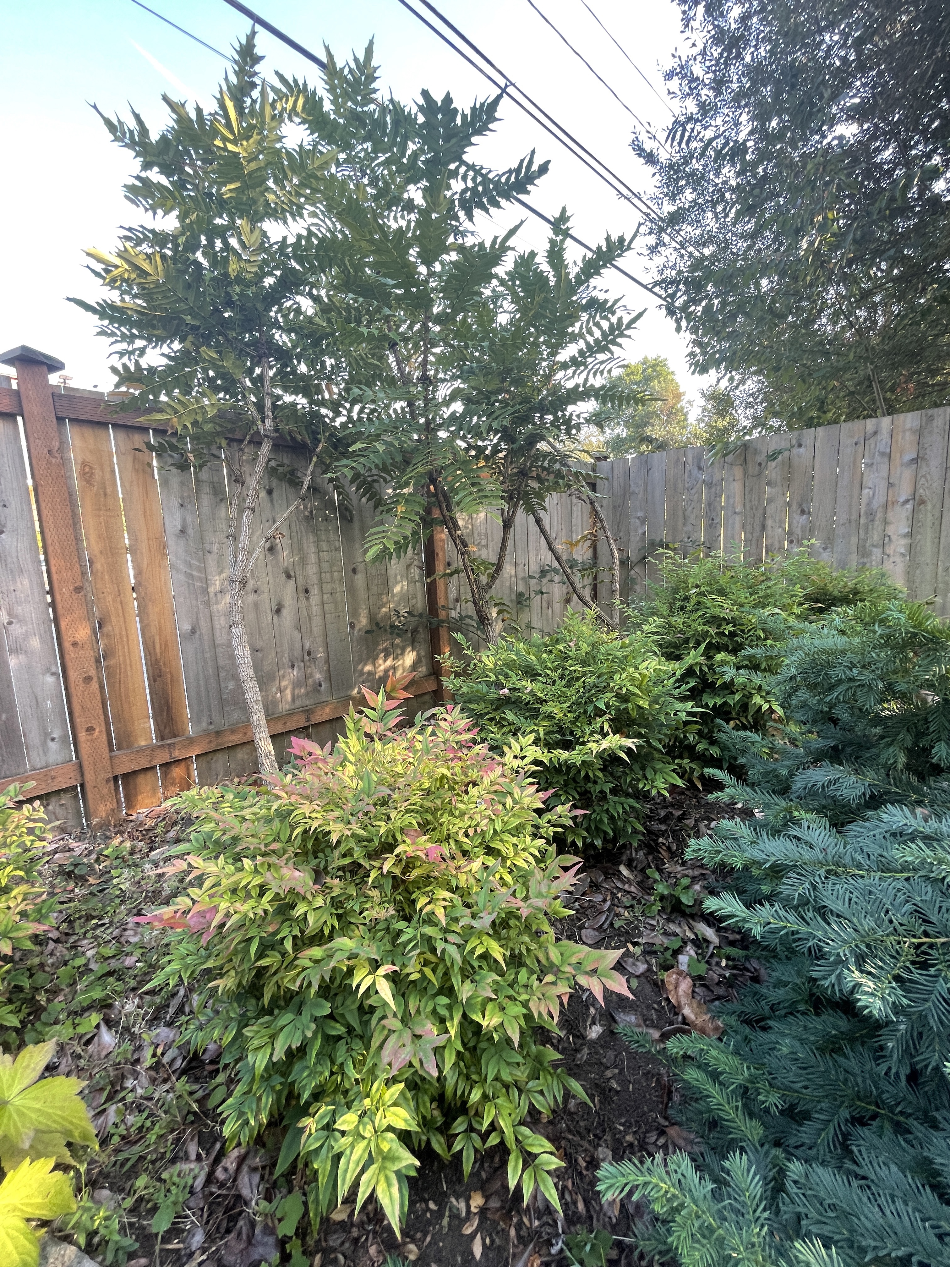
In the formerly neglected upper right corner, three tall prickly mahonias form a backdrop for a row of heavenly bamboos.

Map showing larger new elements of redesigned upper garden.  Letters correspond to photos, above. Compare to schematic design sketch, in Part 2 of this series.

Like all gardens, this one is ever evolving. I am very happy with the changes I initiated six years ago!

All photos by Laura Kraft.

Feel free to share the content of this posting, but please provide a link back to 2H Pencil.

I invite your comments.


Doing Garden Design, part 1: Analyze This

(a 4-part series)

1996                                                            2016

A garden constantly changes over time. So, too, does the gardener. And (lately), so does the climate. After 3 decades of tending my lush and ever-bearing yard, it was time to re-think its current design. There was little to limit my imagination except the limits of my physical ability and my time.

I approached the design similarly to the way I approach any architectural design project, with a progression of phases.

Phase 1. Identify Problems in Need of Solutions:

  • Some beds have become grass-and-weed-choked beyond repair.

this path (L) has become tangled up (R)


  • The shade from established trees has expanded.
  • I have gotten more measured in my energy expenditure as I age, and need to dial down the amount of high-maintenance plants.
  • The summers have gotten hotter and drier; some plants now wither where they used to flourish.

2015-08-29-14-38-43-hdr

this slope became too dry and shady for its plantings


Phase 2. Gather Facts About Prevailing Conditions.

Over the years, I have developed a head full of experience and opinions about this garden’s performance.

The hardscape (paths, stairs, retaining walls, and paved areas) has been developed over the years. It will essentially remain as-is.

I have noted plantings that have succeeded and those that failed. Some of them combine with others. Some are easy to care for. Some offer great rewards, such as long blooming time, delicious scents, beautiful colors, and/or striking textures.

On the other hand, others are short-lived, invasive, fussy, too chaotic, or I just don’t like them.

I made the following double-duty diagram.

new-plantings-exposure-1

sun/shade exposure        /        existing features, to remain


Examples of elements well worth keeping as-is:

rhodies

enormous old rhododendrons with 70’ tall Western Red Cedar beyond

grove

native ground covers within the rhododendron grove

flower-garden

sunny flower garden near house


Phase 3. Scheme, daydream, and imagine possibilities. Start wish lists, accompanied by deep research in books and on the web. Some of my lists:

  • Flowers I want.
  • Drought-resistant shrubs with “winter interest.”
  • Plants that will bring sparkle to the shade.
  • Plants (from small-to-large) with remarkable foliage.
  • Scented plants to locate near the path.
  • Evergreen ground covers, bedding plants, and specimens.
  • Plants with notable shapes.
  • And so on…

wish-list

I love the evocative names, and all of the promises they hold

At the end of this third phase, armed with information and ideas, I am ready to start drawing.

The next 2H Pencil post will be:

Doing Garden Design, Part 2: Plans

upper-plan-rendering_edited-1

Feel free to share the content of this posting, but please provide a link back to 2H Pencil.

I invite your comments.

Save

Save

Plan Now

walkerI just returned from a visit with my 84-year-old mother who was in the hospital because she fell and hit her head. Though she suffered only a nasty black eye and a shock to her system, it was clear to all of us that the danger of her falling had become critical. With my sister, I undertook the task of relocating her to an assisted living apartment. For over a year, Mom had been adamantly against this move, but after her fall, she agreed to it.

No one likes to admit that they are getting older, and that they can’t do things the same way they used to. Many of my parents’ generation continue, with increasing effort, to keep up their lifestyle and routines that have served them well for many years, until there is a crisis. This can come in the form of a fall, a fender-bender, or a diagnosis of self or partner, and suddenly, things need to change. Most often, new arrangements, and all of their attendant upheaval, occur at a moment of maximum stress, when one’s abilities to adjust and cope are already under strain.

With 20-20 hindsight, we can see that the time to have made some accommodations would have been BEFORE the crisis. My sister and I wish we had been able to convince Mom to accept her need for increased assistance many months ago. It would have been so much easier for her to adjust to new patterns and routines when in good health, and the improved arrangements might even have prevented the crisis.

Foresight about the realities of aging-in-place, that is, making accommodations to one’s home for accessibility and safety, requires facing the possibility of loss of abilities that have been taken for granted. It requires clear-eyed practicality and application of “the golden rule” to one’s self.

Appropriate architectural accommodations in homes for aging-in-place, also known as universal design, includes integration of the following:

  • Smooth, ground-level entrances without stairs
  • Surfaces that are stable, firm, and slip resistant
  • Wide interior doors, hallways, and alcoves with 60″ × 60″ turning space at doors and dead-ends
  • Removal of throw rugs and clutter
  • Bright and appropriate lighting, particularly task lighting
  • Accessible switches throughout home, including at both ends of the stairs
  • Additional railings
  • Grab bars in bathrooms
  • A hand-held, flexible shower head
  • Functional clearances for approach and use of elements and components
  • Lever handles for opening doors rather than twisting knobs
  • Components that do not require tight grasping, pinching or twisting of the wrist
  • Clear lines of sight to reduce dependence on sound

For a new home, these accommodations can be smoothly integrated at the outset of the design. For retrofit of an existing home, it can involve some ingenuity to achieve these goals. Increasingly, many of my clients, often “baby boomers” in middle age, are asking for the benefits of universal design. They tell me they want to stay in their homes “for the duration.” They want their homes to be accessible for friends and parents who may use wheelchairs or walkers. They understand that big changes can occur at any time of life.

There is no time like the present to plan for the future.

Related article: Universal Design: What Is It and Why You Should Care. Image courtesy of James Estrin,The New York Times.

Feel free to share the content of this blog, but please provide a link back to 2H Pencil.

I invite your comments.

Architecture Whisperer, No. 4

Behold, the building speaks!  This one says, “The Law of the State is ironclad. Judgment is exacting. Crime does not pay.”

Law Court Offices 1

The Law Court Offices in Venice, Italy consist of a tall, dark and narrow, nearly windowless monolith that connects, at the ground level, to buildings of a re-purposed 19th century factory complex. The varied components of the court system all exist or can be accessed from somewhere within this “black box.”

Law COurt Offices 6The dark form is clad in oxidized copper panels punctuated by narrow windows. The entry is recessed under a 15 foot overhang. The Law Court Offices’ light-absorbing, geometrically simplified presence would be remarkable in any setting.  It stands apart, attracts attention for being different, and strikes a degree of trepidation into the viewer.

In the context of Venice, the City of Water and Light, it is the antithesis of most Venetian buildings, especially those along the Grand Canal, that fairly glitter with surface pattern and ornament.

Ca'd'OroTypically, they meet the ground or water with colonnades, behind which are layered the cool recesses of shadowed loggias. Above is the Ca’ D’Oro.

The historical center of state justice in Venice was the Doge’s Palace, on St. Marks Square. It has fabric-inspired brickwork, pedestrian-friendly Venetian Gothic colonnades, and lacy terra-cotta ornament. This lovely exterior’s grandeur does not, however, correlate with the harsh judgments and punishments that were imposed from within.

Doge's PalaceContrast the Doge’s Palace wall with the Law Court Offices’ wall:

Law Court WallThe architect C+S contends that this simple, archetypical, compact shape and the choice of materials constitute a metaphor representing “institution,” in all of its connotations of tradition, organization, and ritual. In addition to this, I think it symbolizes power, severity, and a general unsympathetic authority.  The State will not be moved. No one can escape justice. This is the message about the Law revealed by Venice in its choice of this design.

As an interesting contrast, the new Law Courts of Bordeaux, France, deliver an entirely different message about the Law.

richard-rogers-law-courts-bordeauxIn the words of its architect Richard Rogers, “This form with its enclosing roof creates a legible container of parts.” The cone-shaped masses are courtrooms. Circulation paths and connections can be seen.

Rogers says that the building intentionally “emphasizes, through a feeling of transparency and openness, a positive perception of the accessibility of the French justice system.“

Whether or not French and Italian legal systems are exceptionally different from one another, these two municipalities have built architecture that speaks of two very different things.

Photo No. 1 courtesy of Pietro Savorelli; Photo No. 2 courtesy of  Alessandra Bello; Photo No. 3 courtesy of Pietro Savorelli; Photo No. 4 courtesy of Wikipedia; Photo No. 5 courtesy of John Hopewell’s blog Italy 2010; Photo No. 6 courtesy of Pietro Savorelli; Photo No. 7 courtesy of Peter Augustin.

Feel free to share the content of this blog, but please provide a link back to 2H Pencil.

I invite your comments.

What More Do You Need?

Hot TubThese cold, dark, damp Seattle winter days have me thinking about ways to keep warm. I love this elemental hot tub. The wood-fueled heat exchanger is a simple and obvious example of form following function. The tub is a half-sphere, with squat legs and a useful side shelf. Cold water, supplied with a garden hose, is mixed with steam-heated water to regulate the desired temperature. The couple looks like they are steeping in a colossal cup of tea!

Once in a while, a designed object hits all the right notes.

It is only as complicated as it needs to be in order to work. It performs its job with elegant efficiency. Its material is well suited to the application and the material’s properties are appropriately exploited. The object’s use is obvious to the user.

Its form and function resonate with one another, clear as a bell.

The photo was featured on a Metropolis Magazine cover, sometime before 2003. The Dutchtub Original was designed by Floris Schoonderbeek. The quote above is from Sweet Spot, posted in this blog in September 2012.

Feel free to share this image, but please provide a link back to 2H Pencil.

I invite your comments.

Bad, and Not in a Good Way

It’s easy to point out bad architecture.  There it is, in your face, and you simply know it’s wrong. We take a certain pleasure in “epic fails,” including failures of architectural design.

Just what makes a building bad?  The traditional 3 criteria for evaluating architecture are: “firmness, commodity, and delight,” (in other words, structural stability, appropriate functionality, and attractive appearance).  When some or all of these things are not achieved, it’s bad.

Bad-Architecture-009Bad because it lacks firmness.
It’s going to fall down.
Everyone can agree.

 driveway_steep

Bad because it lacks commodity.
It won’t work as it should.
Everyone can agree.

 ponte-johannesburg_2159772k Bad because of lack of delight.

It’s ugly.

That’s just my opinion; others may disagree.

This is the Ponte City Apartments in Johannesburg. I think it’s ugly for the following reasons:

  • It lacks rhythm and differentiation.
  • The pattern of windows and concrete is completely predictable all the way up.
  • The big sign on top is commercial and cheap-looking.
  • It’s massive and clumsy compared to everything around it.

There are many websites devoted to bad/ugly architecture.  Several are listed below.  You won’t be disappointed when you visit these sites!

Do you agree that all of the projects deserve scorn?  You may find that you like some of them.  What are the reasons you find them good or bad?

1st photo courtesy of Funzu.com; 2nd photo courtesy of International Assoc. of Home Inspectors; 3rd photo courtesy of Alamy.

Feel free to share any of these images, but please provide a link back to 2H Pencil.

I invite your comments.

Sweet Spot

Once in a while, a designed object hits all the right notes.

It is only as complicated as it needs to be in order to work. It performs its job with elegant efficiency. Its material is well suited to the application and the material’s properties are appropriately exploited. The object’s use is obvious to the user.

Its form and function resonate with one another, clear as a bell.

This one-piece Lucite soap dish (circa 1975, designer unknown) is such an object:

View

plan

Plan

Front Elevation

Side Elevation

All images belong to Laura Kraft-Architect. Feel free to share any of these images, but please provide a link back to 2H Pencil.  Thanks.