Best Tool for the Job

In the 21 months since I posted ”Why I Prefer Using a Pencil” on 2H Pencil, technology has marched on. We’ve been through slightly more than one cycle of the phenomenon described by Moore’s Law, that integrated circuits double in performance every 18 months. Devices have gotten smarter and smaller and more connected. BIM, 3-D modeling, 3-D printing and the Cloud are the current darlings of architectural office technology.

In this time period, I’ve continued to think about my relationship to technology. Rather than classify myself as a “tech geek” or a “non-tech geek”, I am, simply, VERY selective about the technology I adopt and use regularly. I prefer a car with a stick shift, because I like to feel the workings of the engine. I prefer not to have a phone on my person at all times, because it feels intrusive and distracting. I prefer to have GPS available when I am on the road. I still prefer using a pencil when it comes to drafting.

For a while in my career, I was in sync with my professional peers with regard to architectural office technology. And when offices began to replace manual drafting with CAD, I learned the fundamentals along with everyone else. But by then, I was more involved in the management than the production side of projects; at that time, CAD was used strictly for production of construction documents. So I used a red pencil on printouts more than I sat at the Microstation.

I was not in the habit of using CAD when I started my own firm twenty years ago. Laura Kraft  Architect is intentionally a one-person firm, structured so that can follow my preferences as I see fit.   As a solo practitioner, I have no need for in-house team coordination/collaboration/sharing. Processes and findings are all stored in my head or on paper, or as digital files in Word, Excel, WordPress or ArchiOffice. In addition to these technologies I do use, I’ve got an iPad on which the mail, web and portfolio apps are the most useful for my architecture practice. However, I find that in the course of a day, I still prefer a notebook to a note-recording app.

I’ve got Vectorworks and Sketchup on my office computer, and can get around both programs. I use them on rare occasions when they can do something that the combination of a pencil, an enlarging & reducing copier, a scanner, a digital camera, and/or a quick chipboard model can’t do.

As mentioned in my first post, for the scale and one-off character of custom residential design, the focus of my practice, I believe manual drawing is a viable and appropriate tool. Hand drawn/drafted Pre-design and Schematic drawings are perfectly expressive, informative, loose and evocative for clients’ needs. Custom residential construction documents do not necessarily require the extreme precision available and inherent in CAD.

For me, some significant points against CAD are these: in my office, there is no IT department except for a portion of my own left-brain. When glitches occur, as they do according to Murphy’s Law, it’s incumbent on me to figure them out and fix them. Problems are eventually solved, but at often at too high a cost of time and aggravation. Add to this the necessary, frequent, and expensive upgrades to keep the system viable. Sometimes, advanced technology can take more than it gives.

However, when an un-filled need arises, I can enthusiastically embrace a high-tech approach, if it holds a workable solution. As an example, in the past 7-8 months, I have given free rein to a strong artistic impulse, which has expressed itself as digital art, created with Photoshop Elements, and then printed on a high quality printer. The process I have chosen to work with would seem to fly in the face of my hands-on proclivity.

This is a primary reason I currently make use of a digital process: the first image below is an oil painting I started over 30 years ago, reworked numerous times, and never finished. Re-working the gradients led to a loss of freshness and luminosity, which I desired. You can see that the multiple layers of paint have begun to slough off. I never gave up on wanting to resolve this image. There was something about the rotation of forms, the gradients, and the ambiguous relationship of foreground to background that intrigued me.

 painting _edited-1Hand painted with oils on canvas

Rotation test_edited-1Digitally created

The second image is a recently created digital version. With the computer, I was able to try many versions of the composition, adjusting the characteristics of the gradients, the colors, and the forms in a relatively short time interval. The Elements program allowed a range of explorations that were not within my grasp with the paintbrush. After 30+/- iterations, I came to a resolution that feels right to me. I don’t think that the manual process would have ever been the way to work out the problems in this painting.

I discovered an ironic reversal of the architectural “tech geek” ethos. In architecture, technology such as CAD, BIM, and 3-D modeling are embraced and preferred as predominant tools, whereas hand-drawing and manual processes are seen as oddities/novelties (though much appreciated by contractors, I find). However, in the art world, digital art is often stigmatized as less authentic than, and inferior to “hand-made” art.   As a category, it is commonly excluded from calls for work in competitions, awards, shows, etc.

Now I’m in the position of, on one hand, extolling use of the pencil for my technical drawing (no longer a conventional method), and on the other hand, extolling use of the computer for creation of my art images (also a non-conventional option). This apparent contradiction is, in fact, consistent because these choices, and all of my technology choices, are based on evaluation of how the pros and cons of each tool adds up for me. I hold that technology is best when it serves unobtrusively as a means to an end. When I find a tool that improves my process, I embrace it. When I find a need that can best be met by some new form of technology, I use it. If a tool impedes my process, I reject it. If some new gadget or program fills a need that I don’t have, I pause and reflect; adoption of such things can create a need where there was none before, and then there is no going back. So in these instances, my tendency is to resist the seduction of “the next new thing,” in order to keep life, architecture and art as simple and uncluttered as they can be.

All Images courtesy of Laura Kraft.

Feel free to share any of these copyright-protected images, but please provide a link back to 2H Pencil.

What do you think? I invite your comments.


What More Do You Need?

Hot TubThese cold, dark, damp Seattle winter days have me thinking about ways to keep warm. I love this elemental hot tub. The wood-fueled heat exchanger is a simple and obvious example of form following function. The tub is a half-sphere, with squat legs and a useful side shelf. Cold water, supplied with a garden hose, is mixed with steam-heated water to regulate the desired temperature. The couple looks like they are steeping in a colossal cup of tea!

Once in a while, a designed object hits all the right notes.

It is only as complicated as it needs to be in order to work. It performs its job with elegant efficiency. Its material is well suited to the application and the material’s properties are appropriately exploited. The object’s use is obvious to the user.

Its form and function resonate with one another, clear as a bell.

The photo was featured on a Metropolis Magazine cover, sometime before 2003. The Dutchtub Original was designed by Floris Schoonderbeek. The quote above is from Sweet Spot, posted in this blog in September 2012.

Feel free to share this image, but please provide a link back to 2H Pencil.

I invite your comments.

Clean and Simple

Design is a response to needs/wants. This backsplash design was generated in response to 5 things my client wanted:

  • a display shelf above the kitchen counter
  • a way to prevent various forms of kitchen crud from settling into seams
  • a cleanable surface behind all cooking activities
  • continuous, concealed power access under the upper cabinets, with no penetrations into the wall
  • concealed task lighting

Custom fabricated stainless-steel back splash with integrated shelf.

Continuous plug strip at wall, task lights forward. (One off and one on in this photo.)

Flush termination of steel at end of wall. Radiused transition between shelf and wall eliminates a seam.

Section Detail

All images belong to Laura Kraft-Architect. Feel free to share any of these images, but please provide a link back to 2H Pencil. Thanks.

Uptick in Drop Off Zones

According to the AIA’s recent 2012 Home Design Trends Survey, as summarized in an online AIA article, Mud Rooms/Drop Off Zones stand out as the sole “special function” spaces that are increasing in popularity among the three most desirable spaces included in home remodels and additions.

Early in 2007, I named, defined, and described the Drop Off Zone in the Drawing Board column of Fine Homebuilding Magazine as “a front-room feature that caters to the gadgets and trappings that accompany you whenever you enter or leave the house.”   Here are a few examples I have designed:

features include a tile floor, built-in seating, mail sorting cabinet, and a coat closet

drop offelectrical connections are concealed in the cabinetry for charging a variety of devices

design sketch for Drop Off Zone shown below in photo

One hook, one large and one small drawer per family member

Along with Drop Off Zones, the survey cites home offices and outdoor living areas/outdoor rooms as the other two top choices for clients’ remodeling projects, though they are not currently growing in popularity.

As compared to new construction, “improvements to existing homes remain the strongest sector of the housing market…(encompassing) kitchen and bath remodels, as well as additions and alterations to existing homes.” In general, people are concerned with energy efficiency, and design for aging in place.

All of these types of improvements are key components of projects in my practice of architecture.

All images belong to Laura Kraft-Architect. Feel free to share any of these images, but please provide a link back to 2H Pencil.  Thanks.

Too Much Information

Like many people, I am awash in a magazine tsunami. I subscribe to eleven magazines*, and several more come unbidden. This wouldn’t be a problem if I didn’t want to actually read through each one.  The small piles build up into large incriminating piles, an ever-present reminder that I have fallen behind. The magazines on my list frequently have great photos and interesting, informative articles, so once they are read, it seems just wrong to say goodbye and recycle them.  But archiving so many titles would fill every square inch of my space in no time.

Always a believer in systems, and a fan of order and simplicity, I started a system 13 years ago to deal with my magazines. I keep a pile of each title, with the oldest issue on top.  This way, I can read them in chronological order and get something out of the letters and responses to the previous issue.  I carve out 45 minutes to read each issue.  Longer, if it is interesting enough.

“Fine Homebuilding” and “Consumer Reports” are always archived because they are useful references; each is well-indexed and easy to search. For the other design magazines, any image, article, paragraph, poem, chart or advertisement that catches my attention, whether because it is great, awful, curious, odd, poignant, beautiful, or funny, gets clipped out and saved.

On a rainy day, (plentiful in Seattle), I go through the clippings. Those that still strike me as noteworthy are glued into blank spiral notebooks.  The clippings are arranged rather casually, and lightly annotated.** Here’s a peek at random selections from several notebooks:

the amazing work of  E. Fay Jones, architect of the Thorncrown Chapel

Carlo Bugatti Chair, c. 1900, woven chair, Reversatables,  “My Go” chair, cute lion

use of transparency at Liberal Arts and Science Center,  Quatar College, by Kazuhiro Kojima + Kazuko Akamatsu/C+A with Arata Isozaki & i-NET

a soaring flat roof can make a building—Indianapolis Motor Speedway Pagoda on left, Danforth Plant Science Center by Grimshaw and HOK

lyrical sky bridge by Wilkenson and Eyre Architects

red house by Jarmund/Vigsnaes, color inside cabinets and on door jambs

I’m now up to my seventh notebook.  Culled from a tsunami of magazines (13 years x 12 issues/year x 7 design titles = 1092 issues). Pleasingly distilled, fun to look through.

* My magazines: Architect,  Architectural RecordConsumer ReportsDwellFine HomebuildingThe Funny TimesMetropolisThe New YorkerPreservationThe Smithsonian, and Sunset. I got the following until they were discontinued: Nest, Progressive Architecture, and Architecture.

**My only regret, now that I have a blog, is that I didn’t write down complete attributions for the material, so that most of it can’t be directly reused. From now on, I will clip the author and/or photographer’s name with the material so that it can be properly credited.

All images belong to Laura Kraft-Architect. Feel free to share any of these images, but please provide a link back to 2H Pencil.  Thanks.

What is Junk?

“Have nothing in your house that you do not know to be useful, or believe to be beautiful”. —William Morris

Untitled

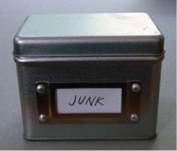
Every member of every household has at least one special stash of Junk.  It might be a drawer, a box, or a room. I have a Junk Box.

The contents of this box have been with me for many years, some since childhood. Inside of I find another box- a Russian painted oval filled with bracelet charms and a lapel pin. Along with it is an assortment of oddities, such as a miniature Etch-a-sketch, two petrified mini-pancakes from Amsterdam, and a penny minted in the city and year of my birth.

j2

The mementos  are not Junk, because they ARE, in fact, useful, as prods to my memory.  To me, they are dense with personal meaning, and as such, are beautiful to me.  Maybe I should re-label the box “Treasures.”

j3

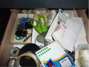
My Junk Drawer brims with a collection of things that are useful for certain needs, yet don’t fall easily into categories, so they don’t belong anywhere else.   Among other things jumbled together in the top right drawer of my kitchen, I have scissors, empty CD cases, and an envelope of Euros .  A drawer of uncategorizable things, not beautiful, but because they are useful, not Junk.

There is a way-station in my garage which holds a small tower of items I plan to give away, recycle, or sell on Craigslist.  They are no longer useful to me, but they will have use for someone else.  This, therefore, is not a Junk Pile.

I think my only true Junk is stuff that I think is no longer reasonably useful to anyone.  After careful consideration, I’m enthusiastic about clearing out useless stuff.  It goes in the trash.  It makes me feel a little lighter and less encumbered.

All images belong to Laura Kraft-Architect. Feel free to share any of these images, but please provide a link back to 2H Pencil.  Thanks.