Asymmetry

450px-Chartres_1

Chartres Cathedral

Asymmetry is literally a lack of symmetry. It is usually defined in negative terms such as “objects that are not identical on both sides of a central line,” or those having a “failure of parts to correspond to one another in shape, size, or arrangement.“  It has been described as distorted, disquieting, out of place, hyperactive, tiresome, and threatening.

This blog post is a consideration of asymmetry in positive terms.

1.  Asymmetrical objects cause our eyes to actively scan, and our minds to actively evaluate the unequal parts of the form, seeking balance.  I feel this active engagement as stimulation, engagement, and fascination. Sometimes, a dynamic balance is achieved in an object; sometimes it is not.

2.  In addition to being a source of formal interest, asymmetry can deliver vital information. There are examples of extreme asymmetry in living things, such as this type of flounder, which has both eyes on the right side of its body. Other species of flounder are known to have both eyes on the left side of their bodies.  This is functional for them because they live at the bottom of the sea with enormous pressures causing them to lie flat.
Kuvalähde: Wilhelm vonWright: Pohjolan kalat.
CrabGross asymmetry such as that of the fiddler crab above can tell a story about a creature’s role, functioning, or habitat.  It raises the question, “What are the functional reasons for this particular form?”

3. There are degrees of symmetry. The human face is generally symmetrical, with 2 eyes, 2 nostrils, 2 cheeks, and 2 eyebrows. Yet on closer inspection of almost every face, inequality of the parts is obvious. Asymmetry is the source of interest, beauty, ugliness, and expression.

b849cc4f3f3cbfd185a6d84c47da75c6_6

Marilyn Monroe’s iconic and memorable face (top center) is admired. By mirroring just the left side (lower left), and comparing that to a mirroring of only the right side (lower right), we can see that it is far from symmetrical in structure and detail. Her facial imbalance gives her vulnerability and compelling beauty. She even darkened her beauty mark to enhance the irregular composition.

4. For human-made things, composition is a result of choices. What is the meaning or message in the choice to “go crooked?” In the early 1900s, Kazimir Malevich, a Russian Suprematist artist, created elemental, abstract art, which was shocking and radical in its time.

 malevich.black-red-square
malevich.petersburg
Here are some famous examples of architecture in which, as described in the four points above, asymmetry :
1. stimulates active engagement opening the possibility of stimulation and fascination.
2. raises questions about the functional reasons for its particular form.
3. is the source of interest, beauty, ugliness, and expression.

4. raises questions about the meaning or message in the choice to “go crooked”

800px-Thomas_Crane_Public_Library,_Quincy,_Massachusetts_(Front_view)

Thomas Crane Public Library by H.H. Richardson, 1882.

asymmetry-architecture-beauty

Auditorio de Tenerife by Santiago Calatrava, 2003

fallingwater

Fallingwater by Frank Lloyd Wright, 1939

lotheringen_12

Coetzee House by Emilio Eftychis, 2005(?)

Niterói_Contemporary_Art_Museum

Niteroi Contemporary Art Museum by Oscar Niemeyer, 1996.

Miyakonojo 2

Miyakonojo Civic Center in Miyakonojo, by Kiyonori Kikutake, 1966, Metabolist Architecture

Chartres Cathedral image courtesy of Wikipedia.

First photo of a flounder courtesy of TBD; second image of a fiddler crab courtesy of Google Images; third image of Marilyn Monroe courtesy of upscale; images of Malevich paintings courtesy of Web Museum.

First architectural example courtesy of Wikipedia, second courtesy of  Wikipedia; third courtesy of fallingwater.org; fourth courtesy of designboom; fifth courtesy of Wikepedia; sixth courtesy of Panaramio.

Feel free to share any of these images, but please provide a link back to 2H Pencil.

I invite your comments.

Illusions, No. 2

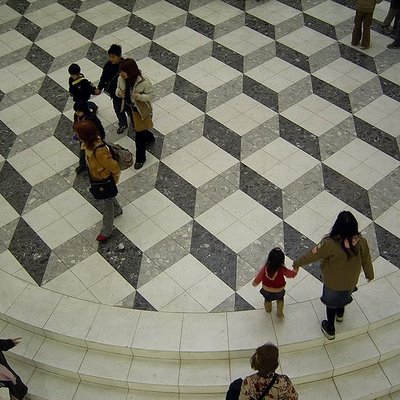
The impulse to challenge users and viewers has long been at the heart of trompe l’oeil (fool the eye) projects. When the eye sees something, the body believes it.

Two-dimensional patterns (made with tiles, carpet, paint, or…..) can create the optical illusion of three dimensionality.

Image

In the pattern above, do you see stacked cubes with white tops? Or white bottoms?  Does the image change back and forth for you?

pattern 7

Here, the colors are rearranged. Is the white surface the top, right, left, or bottom of the cube?

Image

Does this pattern look flat or 3-D? Do you see square holes or pyramids?

Pattern 2

Is this arrangement actually possible in three dimensions?

L Accademia

This sketch of the floor pattern at the Accademia Museum in Venice shows square “recesses” in the medallion on the right, anchored in a flat peach-colored field.  The 3-D illusion is contained, and I don’t fear falling through this floor.

82962747_4cb33a8ac4

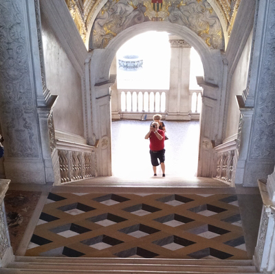
Would this give you vertigo?

Golden_Staircase400

Would this stair landing make you pause before walking on it?

GEORGE-WINTERINGHAM_LISBONPAVING3

Can you feel the surface ripple?

3D-Optical-Illusion-Carpet

Does this (actually flat) carpeting make you want to stagger? Or worse?

warped

A computer-generated tile design clads these perfectly flat and plumb surfaces. Architect Thom Faulders‘ client said, “I wanted someone to barf when they look at it.” This illusion, versus the reality of its flatness, comes close!

The first five drawings were made by me. The first and second photos’ attributions are TBD; the third photo is courtesy of George Winteringham, via Patternity; the fifth photo is courtesy of Vurdlak; the sixth photo is courtesy of Thom Faulders.

Feel free to share the content of this blog, but please provide a link back to 2H Pencil.

I invite your comments.

Illusions, No. 1

This California garden looks like the sea floor.  The plants look like sea-dwelling creatures and plants. The imagination swims!

Beachside succulent garden; Sep'12; "underwater" plants

Beachside succulent garden; Sep'12; Tide pool beach garden n Corona Del MarSucculents expert and horticulturist Joe Stead says, “As a kid, I explored tide pools …I marveled at the starfish and sea anemones. I wanted to bring that sense of wonder to this garden.”

With great knowledge and skill, he has selected and arranged boldly colored, drought-tolerant plants to create charming and compelling illusions.

Beachside succulent garden; Sep'12; Tide Pool Beach Garden n Corona Del Mar, CA    The “sea anemones” are agaves, nestled among red mangaves.

Beachside succulent garden; Sep'12; Tide pool beach garden n Corona Del Mar  The “starfish” is Echeveria subrigida.

Beachside succulent garden; Sep'12; "underwater" plantsThe “kelp” is Senecio vitalis.

All photos courtesy of Bret Gum; written content is derived from the article “How to create a sea-creature succulent garden,” written by Debra Lee Baldwin, in Sunset Magazine.

Feel free to share the content of this blog, but please provide a link back to 2H Pencil.

I invite your comments.

Who’s in front?

In the drawing class my first year of architecture school, our professor gave us an assignment to represent ambiguous depth cues, one of which is occlusion (or overlap)–the location of an object in front of another, which tells you it’s closer.

I remain fascinated with the idea that through manipulation of this particular depth cue, foreground and background can be made to switch places.

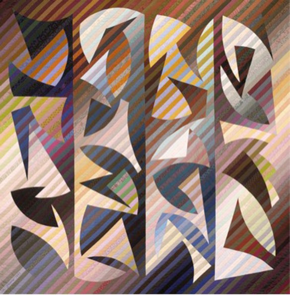
The quilter Michael James has crafted some amazing quilts, using parallel strips of hand-dyed cloth. At 90″x90″, it’s engulfing in scale, and perfectly gorgeous.

“Suspended Animation,” Michael James, 1992

I see brightly colored forms floating in front of dark, receding empty space. But then a moment later, the dark substantial forms are in front of a bright receding background. I love the way the figure and ground pop back and forth as my eye follows the edges of the forms. Though it is a fixed image, it is very active. It is like a puzzle and a riddle.

Here’s another with similarly reversing negative/positive space:

“Quilt No. 150: Rehoboth Meander,” Michael James, 1993, The Renwick Gallery of the National Museum of American Art, Smithsonian Institution, Washington DC.

There is a long tradition of quilters’ exploration of figure and ground reversal.

In another medium altogether, this is an oil painting of mine in which I play with occlusion. It keeps my eyes and mind engaged.

Untitled, oil on canvas, Laura Kraft, 1978

First image courtesy of International Quilt Study Center and Museum, second image courtesy of Smithsonian American Art Museum

All other images belong to Laura Kraft-Architect. Feel free to share any of these images, but please provide a link back to 2H Pencil.  Thanks.

Accentuate the Negative

I recently had a chance to teach a few classes about architecture and design to some bright 5th graders.  They were  excited by the following demonstration.  First, we looked at these yellow columns:

Then we looked again, with a hint:  LOOK AT THE SHAPES OF THE SPACES BETWEEN THE COLUMNS.  This brought on gasps of recognition and laughter. The negative space popped into the foreground and became the forms of people.

The moment when perception changes is jarring and provocative. The two different sets of information, once discerned, compete for foreground status.

Positive and negative space can provide an interesting lens with which to look at plans of buildings and towns. The gray shapes are the buildings in Martina Franca, an Italian town founded around 1300. Those with crosses drawn on them are churches. Interesting that there is barely a rectangular shape to be found.

To get a different perspective, reverse the positive and negative, and focus on the branching circulation paths. The wider parts are the gathering places. This image (below) showing  the twisting streets, the dead ends, and the irregularly shaped plazas, gives an insight into what it was like to get around this town.

When designing a building or group of them, it is useful and informative to “pop” the shape of the circulation space into the foreground and look at it as a thing in its own right.  It’s not just leftover square footage—it’s the connective tissue of the experience of the place.

First image courtesy of coolopticalillusions.com. Town plans adapted from “Streets for People,” by Bernard Rudofsky.

Feel free to share any of these images, but please provide a link back to 2H Pencil.  Thanks.