Architecture Whisperer, No. 1

Behold, the building speaks! This building says, “OUCH!

The Shooting Venue for the 2012 London Olympics has a tensile fabric skin with scattered protruding colored portals.

One of two things have caused these angry lesions. The building may have been assaulted with deadly force by the shooting competitors within.

Metal surface scarred by bullets coming through from the other side.

On the other hand, it is possible that the building is screaming for Calamine Lotion. Lots of it. NOW.

1st image courtesy of  Magma Architecture, 2nd image rendered using “bullet hole brushes” in Adobe PSE, 3rd image courtesy of Current TV

 Feel free to share any of these images, but please provide a link back to 2H Pencil.  Thanks.

Who’s in front?

In the drawing class my first year of architecture school, our professor gave us an assignment to represent ambiguous depth cues, one of which is occlusion (or overlap)–the location of an object in front of another, which tells you it’s closer.

I remain fascinated with the idea that through manipulation of this particular depth cue, foreground and background can be made to switch places.

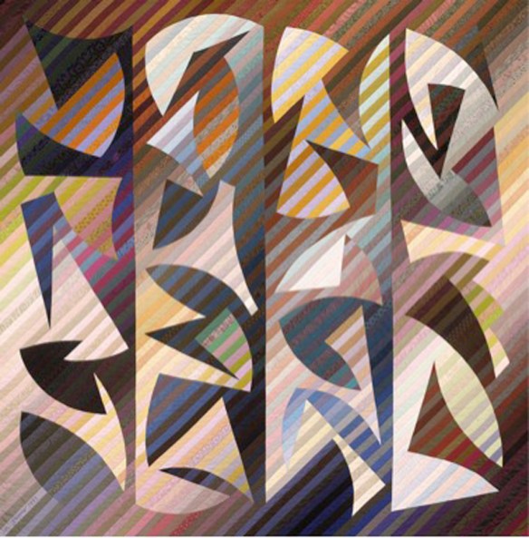
The quilter Michael James has crafted some amazing quilts, using parallel strips of hand-dyed cloth. At 90″x90″, it’s engulfing in scale, and perfectly gorgeous.

“Suspended Animation,” Michael James, 1992

I see brightly colored forms floating in front of dark, receding empty space. But then a moment later, the dark substantial forms are in front of a bright receding background. I love the way the figure and ground pop back and forth as my eye follows the edges of the forms. Though it is a fixed image, it is very active. It is like a puzzle and a riddle.

Here’s another with similarly reversing negative/positive space:

“Quilt No. 150: Rehoboth Meander,” Michael James, 1993, The Renwick Gallery of the National Museum of American Art, Smithsonian Institution, Washington DC.

There is a long tradition of quilters’ exploration of figure and ground reversal.

In another medium altogether, this is an oil painting of mine in which I play with occlusion. It keeps my eyes and mind engaged.

Untitled, oil on canvas, Laura Kraft, 1978

First image courtesy of International Quilt Study Center and Museum, second image courtesy of Smithsonian American Art Museum

All other images belong to Laura Kraft-Architect. Feel free to share any of these images, but please provide a link back to 2H Pencil.  Thanks.

Uptick in Drop Off Zones

According to the AIA’s recent 2012 Home Design Trends Survey, as summarized in an online AIA article, Mud Rooms/Drop Off Zones stand out as the sole “special function” spaces that are increasing in popularity among the three most desirable spaces included in home remodels and additions.

Early in 2007, I named, defined, and described the Drop Off Zone in the Drawing Board column of Fine Homebuilding Magazine as “a front-room feature that caters to the gadgets and trappings that accompany you whenever you enter or leave the house.”   Here are a few examples I have designed:

features include a tile floor, built-in seating, mail sorting cabinet, and a coat closet

drop offelectrical connections are concealed in the cabinetry for charging a variety of devices

design sketch for Drop Off Zone shown below in photo

One hook, one large and one small drawer per family member

Along with Drop Off Zones, the survey cites home offices and outdoor living areas/outdoor rooms as the other two top choices for clients’ remodeling projects, though they are not currently growing in popularity.

As compared to new construction, “improvements to existing homes remain the strongest sector of the housing market…(encompassing) kitchen and bath remodels, as well as additions and alterations to existing homes.” In general, people are concerned with energy efficiency, and design for aging in place.

All of these types of improvements are key components of projects in my practice of architecture.

All images belong to Laura Kraft-Architect. Feel free to share any of these images, but please provide a link back to 2H Pencil.  Thanks.

Accentuate the Negative

I recently had a chance to teach a few classes about architecture and design to some bright 5th graders.  They were  excited by the following demonstration.  First, we looked at these yellow columns:

Then we looked again, with a hint:  LOOK AT THE SHAPES OF THE SPACES BETWEEN THE COLUMNS.  This brought on gasps of recognition and laughter. The negative space popped into the foreground and became the forms of people.

The moment when perception changes is jarring and provocative. The two different sets of information, once discerned, compete for foreground status.

Positive and negative space can provide an interesting lens with which to look at plans of buildings and towns. The gray shapes are the buildings in Martina Franca, an Italian town founded around 1300. Those with crosses drawn on them are churches. Interesting that there is barely a rectangular shape to be found.

To get a different perspective, reverse the positive and negative, and focus on the branching circulation paths. The wider parts are the gathering places. This image (below) showing  the twisting streets, the dead ends, and the irregularly shaped plazas, gives an insight into what it was like to get around this town.

When designing a building or group of them, it is useful and informative to “pop” the shape of the circulation space into the foreground and look at it as a thing in its own right.  It’s not just leftover square footage—it’s the connective tissue of the experience of the place.

First image courtesy of coolopticalillusions.com. Town plans adapted from “Streets for People,” by Bernard Rudofsky.

Feel free to share any of these images, but please provide a link back to 2H Pencil.  Thanks.

Too Much Information

Like many people, I am awash in a magazine tsunami. I subscribe to eleven magazines*, and several more come unbidden. This wouldn’t be a problem if I didn’t want to actually read through each one.  The small piles build up into large incriminating piles, an ever-present reminder that I have fallen behind. The magazines on my list frequently have great photos and interesting, informative articles, so once they are read, it seems just wrong to say goodbye and recycle them.  But archiving so many titles would fill every square inch of my space in no time.

Always a believer in systems, and a fan of order and simplicity, I started a system 13 years ago to deal with my magazines. I keep a pile of each title, with the oldest issue on top.  This way, I can read them in chronological order and get something out of the letters and responses to the previous issue.  I carve out 45 minutes to read each issue.  Longer, if it is interesting enough.

“Fine Homebuilding” and “Consumer Reports” are always archived because they are useful references; each is well-indexed and easy to search. For the other design magazines, any image, article, paragraph, poem, chart or advertisement that catches my attention, whether because it is great, awful, curious, odd, poignant, beautiful, or funny, gets clipped out and saved.

On a rainy day, (plentiful in Seattle), I go through the clippings. Those that still strike me as noteworthy are glued into blank spiral notebooks.  The clippings are arranged rather casually, and lightly annotated.** Here’s a peek at random selections from several notebooks:

the amazing work of  E. Fay Jones, architect of the Thorncrown Chapel

Carlo Bugatti Chair, c. 1900, woven chair, Reversatables,  “My Go” chair, cute lion

use of transparency at Liberal Arts and Science Center,  Quatar College, by Kazuhiro Kojima + Kazuko Akamatsu/C+A with Arata Isozaki & i-NET

a soaring flat roof can make a building—Indianapolis Motor Speedway Pagoda on left, Danforth Plant Science Center by Grimshaw and HOK

lyrical sky bridge by Wilkenson and Eyre Architects

red house by Jarmund/Vigsnaes, color inside cabinets and on door jambs

I’m now up to my seventh notebook.  Culled from a tsunami of magazines (13 years x 12 issues/year x 7 design titles = 1092 issues). Pleasingly distilled, fun to look through.

* My magazines: Architect,  Architectural RecordConsumer ReportsDwellFine HomebuildingThe Funny TimesMetropolisThe New YorkerPreservationThe Smithsonian, and Sunset. I got the following until they were discontinued: Nest, Progressive Architecture, and Architecture.

**My only regret, now that I have a blog, is that I didn’t write down complete attributions for the material, so that most of it can’t be directly reused. From now on, I will clip the author and/or photographer’s name with the material so that it can be properly credited.

All images belong to Laura Kraft-Architect. Feel free to share any of these images, but please provide a link back to 2H Pencil.  Thanks.

Sweet Spot

Once in a while, a designed object hits all the right notes.

It is only as complicated as it needs to be in order to work. It performs its job with elegant efficiency. Its material is well suited to the application and the material’s properties are appropriately exploited. The object’s use is obvious to the user.

Its form and function resonate with one another, clear as a bell.

This one-piece Lucite soap dish (circa 1975, designer unknown) is such an object:

View

plan

Plan

Front Elevation

Side Elevation

All images belong to Laura Kraft-Architect. Feel free to share any of these images, but please provide a link back to 2H Pencil.  Thanks.

What is Junk?

“Have nothing in your house that you do not know to be useful, or believe to be beautiful”. —William Morris

Untitled

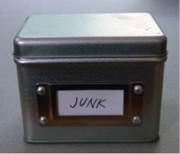
Every member of every household has at least one special stash of Junk.  It might be a drawer, a box, or a room. I have a Junk Box.

The contents of this box have been with me for many years, some since childhood. Inside of I find another box- a Russian painted oval filled with bracelet charms and a lapel pin. Along with it is an assortment of oddities, such as a miniature Etch-a-sketch, two petrified mini-pancakes from Amsterdam, and a penny minted in the city and year of my birth.

j2

The mementos  are not Junk, because they ARE, in fact, useful, as prods to my memory.  To me, they are dense with personal meaning, and as such, are beautiful to me.  Maybe I should re-label the box “Treasures.”

j3

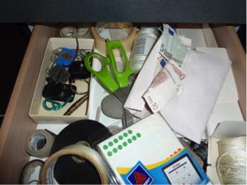
My Junk Drawer brims with a collection of things that are useful for certain needs, yet don’t fall easily into categories, so they don’t belong anywhere else.   Among other things jumbled together in the top right drawer of my kitchen, I have scissors, empty CD cases, and an envelope of Euros .  A drawer of uncategorizable things, not beautiful, but because they are useful, not Junk.

There is a way-station in my garage which holds a small tower of items I plan to give away, recycle, or sell on Craigslist.  They are no longer useful to me, but they will have use for someone else.  This, therefore, is not a Junk Pile.

I think my only true Junk is stuff that I think is no longer reasonably useful to anyone.  After careful consideration, I’m enthusiastic about clearing out useless stuff.  It goes in the trash.  It makes me feel a little lighter and less encumbered.

All images belong to Laura Kraft-Architect. Feel free to share any of these images, but please provide a link back to 2H Pencil.  Thanks.

The Tile Setter’s Floor

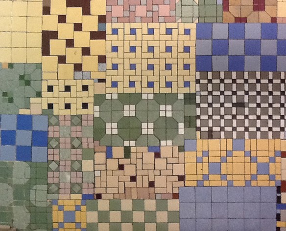
This is the floor in a basement kitchen of a house in NW Washington DC. As the story goes, at one time, the house belonged to a tile setter.

The tile setter brought home tiles left over from his jobs. He laid out patterns and combinations based on the tiles he happened to have on hand.  He allowed himself to try things, without the yoke of rules, just to see what they looked like. He allowed his work to be imperfect. He let his children try their hands at his craft.

The resulting floor is remarkable.  It is like a patchwork quilt.  Each patch is an interesting composition in its own right. The overall combination is delightfully unselfconscious and lively.

All images belong to Laura Kraft-Architect. Feel free to share any of these images, but please provide a link back to 2H Pencil.  Thanks.

Instantaneous

This is a famous 1919 small concept sketch by architect Erich Mendelsohn for an astrophysical observatory in Germany. With a few marks of a broad pen, he captured the essential form of his vision.

The completed observatory is as rounded and pliable as the sketch portrays. The energy of a living organism emanates from both.

Mendelsohn is famous for his visionary sketches.  I think he is a source of the notion that architects’ designs can come to them fully formed, and they can easily dash off ingenious and wonderful sketches on a napkin or any nearby scrap of paper. I think his caliber of talent is rare. Truly visionary sketches only occur in exceptional circumstances.

In ordinary circumstances, the analysis, and the trial & error of the design process take significant time.  Sketches are often done in series to work out, clarify and compare concepts. Most parts of the process require focus, repetition, and evaluation. It can be messy and frustrating, with crumpled tracing paper piling up in and around the recycle basket.  Eventually, when enough thought has been invested, there is a point when the design comes together. After that, and not before, a seductive little sketch can be drawn.

Design is both rational and irrational. Like any creative process, it is somewhat mysterious. Mercifully, we do not have to explain everything about how we arrive at our solutions.

Photos 1 & 2, courtesy of wikiarquitectura.com.

Cartoon Copyright Sidney Harris 2006.

 Feel free to share any of these images, but please provide a link back to 2H Pencil.  Thanks.

Worlds Collide

In my last post, I declared an affinity for objects that show evidence of the human touch. Hand crafted things express far greater humanity than machine-made things.

Civilization, as we know it, has come to depend primarily on machine-made objects, whose world dominates the world of handcraft.  I find, however, that when these two worlds collide, wonderful things can happen.

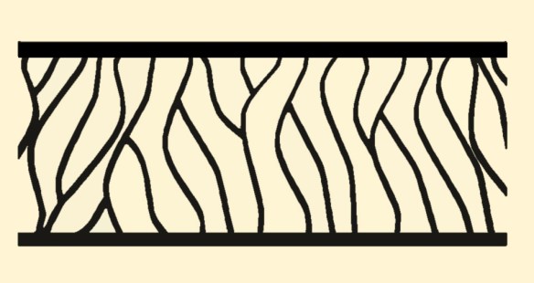
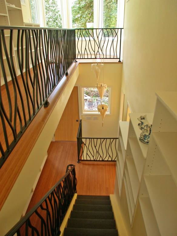
This railing for the central stairway of a house placed a mass-produced item in service of the handmade aesthetic.  For various reasons, including a limited budget, I set the following design constraints:

  1.  All balusters are to be cut from the same 42” long pre-fab S-shaped wrought iron piece, which may be turned, flipped, and rotated.
  2. The baluster design must lie in a flat plane within the 28 inch space between the horizontal rails.
  3. No distance between any two elements may exceed 4”, per code.

Charlie Brown, of Brown Custom Iron created this leafy, wavy design for the stair railing, which goes from the ground floor to the third floor. It is the centerpiece of the house.  The strict design criteria allowed collaboration between Charlie and me. They allowed the design to take its lovely form.  Rules and constraints may have negative connotations for many people, but they play an essential role in the design (or any creative) process. In the words of the composer Igor Stravinsky,

 “The more constraints one imposes, the more one frees one’s self.”


All  images belong to Laura Kraft-Architect. Feel free to share any of these images, but please provide a link back to 2H Pencil.  Thanks.